Misc. Elements, Deployment
Ch 11 - Miscellaneous Elements
Radar, 3D, Choropleth
Plotly Paradise
Although we've explored several core Plotly figures that are used extensively across dashboards, there are a myriad of other charts that can be made using Plotly. In this section, we'll explore a few of them.
NOTE: Feel free to submit requests for other elements. This chapter may be updated to include them as well!
Radar Charts
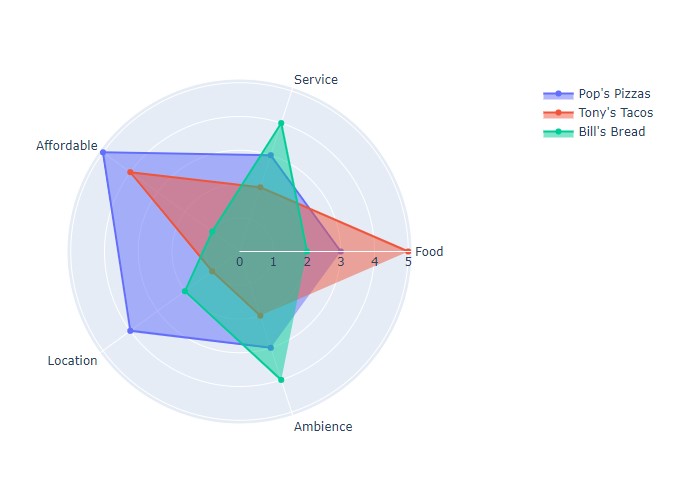
Radar charts are used to visualize different traces across different axes. For example, if one wished to compare restaurants across five different categories, a radar chart would be a perfect visualization.
Let's take a look at creating one with Plotly.
categories = ['Food', 'Service', 'Affordable', 'Location', 'Ambience']

res = {
        "Pop's Pizzas" : [3, 3, 5, 4, 3],
        "Tony's Tacos" : [5, 2, 4, 1, 2],
        "Bill's Bread" : [2, 4, 1, 2, 4],
      }

fig = go.Figure()

for restaurant in res:
    fig.add_trace(go.Scatterpolar(
        r=res[restaurant],
        theta=categories,
        fill='toself',
        name=restaurant,
    ))

fig.update_layout(
  polar=dict(
    radialaxis=dict(
      visible=True
    ),
  ),
  width=800
)

fig.show()
As seen, we create a go.Figure() and add multiple traces. Each trace represents
a distinct data entity, in this case different restaurants. Each restaurant has been
scored across different categories, and categories are stored in theta, while each
value is stored in r. In fig.update_layout(), the figure is converted into polar form to create our circular
radar chart. It's a lot easier to visualize how each restaurant compares!
NOTE: This format is similar to polar axes, where each point is determine in r and theta instead of x and y.
NOTE: For more resources on Radar Charts, feel free to check out the following resources: Plotly Radar
3-D Figures
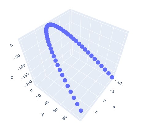
In order to create 3D plots, we can use the px.scatter_3d() function. This simply
requires us to enter a list value for x, y, and z. Dataframes can also be used to
create a 3-D figure, formatted the same as with px.scatter().
Here's an example of a 3D parabolic curve:
import numpy as np

t = np.linspace(-10, 10, 50)

x = t
y = t**2
z = 3*x - 2*y

fig = px.scatter_3d(x=x, y=y, z=z)
fig.show()
NOTE:
np.linspace()simply creates a list from -10 to 10, with 50 data points in between, spaced evenly.
NOTE: For more information on Radar Charts, feel free to check out the following resources: Scatter, 3D Charts
Choropleth (Maps)
Plotly allows for the creation and insertion of geographical maps using geojson data. Choropleth maps
allow for the visulization of distinct geographical zones with different colors to indicate different attributes.
In order to use the Plotly Choropleth example, we need to install the following.
!pip install -U plotly
from urllib.request import urlopen
import json
import pandas as pd
import plotly.express as px
NOTE: We need to upgrade our version of Plotly to the latest to ensure that Choropleth works!
Now, we can use the Plotly datasets in order to visualize the unemployment in the United States.
with urlopen('https://raw.githubusercontent.com/plotly/datasets/master/geojson-counties-fips.json') as response:
    counties = json.load(response)

df = pd.read_csv("https://raw.githubusercontent.com/plotly/datasets/master/fips-unemp-16.csv",
                   dtype={"fips": str})

fig = px.choropleth(df, geojson=counties, locations='fips', color='unemp',
                           color_continuous_scale="Viridis",
                           range_color=(0, 12),
                           scope="usa",
                           labels={'unemp':'unemployment rate'}
                          )

fig.update_layout(margin={"r":0,"t":0,"l":0,"b":0})
fig.show()
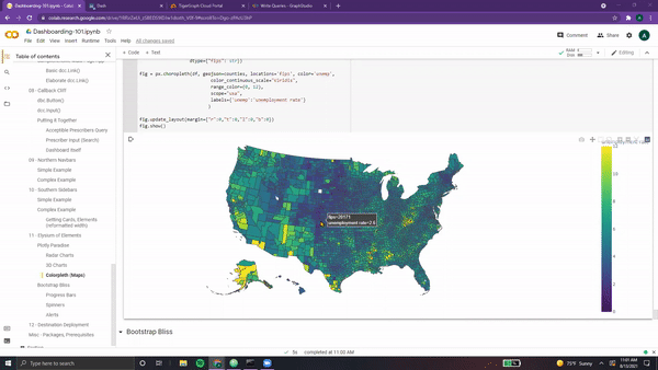
As seen, it's quite a detailed, interactive map!
NOTE: For more information on Maps, feel free to check out the following resources: Choropleth
Progress, Spinners, Alerts
Bootstrap Bliss
As with Plotly, there are dozens of other unique Bootstrap components that can be incorporated into one's dashboard. Although we've covered the core elements, we'll explore three more in this section.
NOTE: For a comprehensive list on all bootstrap components, feel free to check out: Dash Bootstrap
Progress Bars
Progress bars are horizontal, rounded rectangles that are quite flexible when it comes to displaying progress.
Here's an example of a progress bar with three distinct sections.
progress = dbc.Progress(
    [
        dbc.Progress(value=20, color="success", bar=True),
        dbc.Progress(value=30, color="warning", bar=True),
        dbc.Progress(value=20, color="danger", bar=True),
    ],
    multi=True,
)

app = JupyterDash(__name__, external_stylesheets=[dbc.themes.BOOTSTRAP])

app.layout = html.Div(children=[
   dbc.Col(progress, width=6)
])

app.run_server(mode='external')
As seen, each bar section has a different color and length (value).
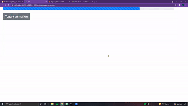
This bar can also be animated, controlled via a button that toggles the bar on and off.
progress = html.Div(
    [
        dbc.Progress(
            value=80, id="animated-progress", animated=False, striped=True
        ),
        dbc.Button(
            "Toggle animation",
            id="animation-toggle",
            className="mt-3",
            n_clicks=0,
        ),
    ]
)

app = JupyterDash(__name__, external_stylesheets=[dbc.themes.BOOTSTRAP])

app.layout = html.Div(children=[
   dbc.Col(progress, width=6)
])


@app.callback(
    dash.dependencies.Output("animated-progress", "animated"),
    [dash.dependencies.Input("animation-toggle", "n_clicks")],
    [dash.dependencies.State("animated-progress", "animated")],
)
def toggle_animation(n, animated):
    if n:
        return not animated
    return animated


app.run_server(mode='external')
Ah-ah, one interesting addition is the variable dash.dependencies.State as
part of our app's callback. This simply means that the state of the progress bar
(whether it is currently animated or not) is also used to determine the output. This
makes sense, since our toggle button inverts whatever the state of the progress bar is.
NOTE: For more information on progress bars, feel free to check out the following resources: Progress
Spinners
Next up, spinners! These components are small circles that move to indicate that a process is occurring.
Here are three examples (one small, one big, and one growing).
spinners = html.Div(
    [
        dbc.Row([
            dbc.Col(dbc.Spinner(size="sm", color="info"), width=1),
            dbc.Col(dbc.Spinner(spinner_style={"width": "3rem", "height": "3rem"}, color="success"), width=1),
            dbc.Col(dbc.Spinner(color="danger", type="grow"), width=1),
        ])
    ]
)

app = JupyterDash(__name__, external_stylesheets=[dbc.themes.BOOTSTRAP])

app.layout = html.Div(children=[
   dbc.Col(spinners, width=6)
])

app.run_server(mode='external')
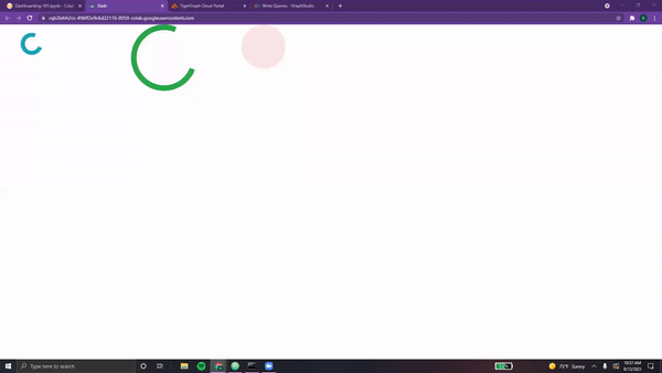
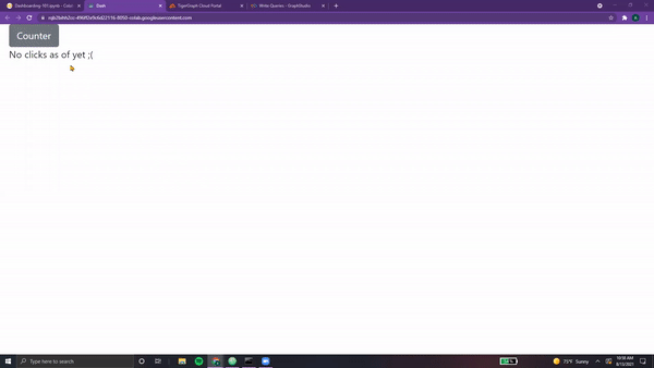
Each can be easily colored, resized, and toggled between traditional mode and growing mode. Spinners can also be used to indicate loading, or to be displayed upon a user action. For example, the following displays a spinner based on the number of times the button is pressed. After the time has elapsed, the spinner is replaced with the output.
import time

loading_spinner = html.Div(
    [
        dbc.Button("Counter", id="loading-button", n_clicks=0),
        dbc.Spinner(html.Div(id="loading-output")),
    ]
)

app = JupyterDash(__name__, external_stylesheets=[dbc.themes.BOOTSTRAP])

app.layout = html.Div(children=[
   dbc.Col(loading_spinner, width=3)
])

@app.callback(
    dash.dependencies.Output("loading-output", "children"),
    [dash.dependencies.Input("loading-button", "n_clicks")]
)
def load_output(n):
    if n:
        time.sleep(1)
        return f"You have clicked {n} times"
    return "No clicks as of yet ;("

app.run_server(mode='external')
NOTE: For more information on spinners, feel free to check out the following resources: Dash Spinners
Alerts
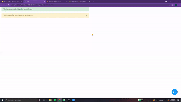
Next up, Dash Alerts! These components are used to display important information, such as messages, information the user should know before proceeding, or any other form of alerts. Like all bootstrap, they are quite flexible.
Here's an example with two alerts, one of them dismissible (able to be closed) and the other permanent.
alerts = html.Div([
        dbc.Alert("This is a success alert! Luckily, I won't leave!", color="success"),
        dbc.Alert("This is a warning alert, but you can close me!", color="warning", dismissable=True),
])

app = JupyterDash(__name__, external_stylesheets=[dbc.themes.BOOTSTRAP])

app.layout = html.Div(children=[
   dbc.Col(alerts, width=6)
])

app.run_server(mode='external')
These alarms can be easily customized in terms of color and content. Additionally, they can be set to automatically
disappear after a certain amount of time. This is done via the keyword duration, which takes in milliseconds.
Here's an example with a disappearing alert, accompanied by a button that toggles the state of the alert.
alert = html.Div(
    [
        dbc.Button(
            "Switch States", id="alert-toggle-auto", className="mr-1", n_clicks=0
        ),
        html.Hr(),
        dbc.Alert(
            "I will disappear in 3 seconds...",
            id="alert-auto",
            color="danger",
            is_open=True,
            duration=3000, # In milliseconds
        ),
    ]
)

app = JupyterDash(__name__, external_stylesheets=[dbc.themes.BOOTSTRAP])

app.layout = html.Div(children=[
   dbc.Col(alert, width=6)
])

@app.callback(
    dash.dependencies.Output("alert-auto", "is_open"),
    [dash.dependencies.Input("alert-toggle-auto", "n_clicks")],
    [dash.dependencies.State("alert-auto", "is_open")],
)
def toggle_alert(n, is_open):
    if n:
        return not is_open
    return is_open

app.run_server(mode='external')
Quite handy, especially to help users navigate a dashboard for the first time!
NOTE: For more information on alerts, feel free to check out the following resources: Dash Alerts
Everything We've Covered
Dash Dreamland
There are hundreds of more Dash elements, including Dash Core Components, Dash Bootstrap Components, Plotly, Ploly Express, HTML, and more. Diving into these elements is beyond the scope of this introductory journey!
However, here's a quick summary of everything we've learned along the way, a sort of cheat-sheet...
| Plotly Charts | Dash/Tigergraph | HTML | Dash Core | Bootstrap |
|---|---|---|---|---|
| Bar Charts | Layout Functions | Div | Graphs | Cards |
| Line Charts | Styling App | Headers | Markdown | Row/Col |
| Pie Charts | Multi-Paged | Paragraph | Location | Badges |
| Scatter Plots | Callbacks | Bold/Italic | Links | ListGroup |
| Cytoscape | Navbars | Center | Input | Jumbotron |
| Radar Charts | Sidebars | Link | Dropdown | Button |
| 3-D Figures | Create Solution | Hr. Rule | Table | |
| Choropleth | Connect w/ pyTG | Line Break | Progress | |
| Install Queries | Image | Spinner | ||
| Run Queries | Alert |
Feel free to utilize the "Search" box at the top right of this webpage to quickly reference each.
We've learned quite a lot within the span of less than a dozen chapters 😄.
NOTE: All code segments from this chapter can be found in this
Ch 12 - Dash Deployment
Deploying Dash App
Heroku, Dash Enterprise
According to the Plotly Website,
"Heroku is one of the easiest platforms for deploying and managing public Flask applications."
Plotly Dash documents the step-by-step procedure needed to deploy one's app on Heroku.
- Additional Resource: Medium Guide 1
- Additional Resource: Medium Guide 2
Another option is via the paid Dash Enterprise platform. Both options are doucmented by Plotly below.
Congratulations!
The Fantastic Finale
Congratulations! You've put together (and maybe even deployed) your dashboard with TigerGraph + Plotly.
It's time to celebrate now! 🥳🥳🥳
Feel free to continue adding, maybe with a few queries and some of the elements from "Elysium of Elements".
Additionally, there are quite a few examples of other Starter Kits under the "Examples" tab!.
Finally, make sure to connect with the TigerGraph + Plotly community (found under the "Community" tab).
Best of luck, and remember to share your cool work with others in the developer world!
Congratulations, you've completed TigerGraph's Dash Adventure!