Presenting Port Plotly 🧱

Looking around, there are hundreds of stalls set up throughout the port, each with a different banner and symbol hung up next to them. A sign labelled Visitor's Guide catches our eyes. Approaching it, we find a small box of pamphlets attached onto the sign. As we begin to read, we pull out our laptop and once again begin to take note of the strange wisdom.
"Welcome! In order to fully experience Plotly, we need to go over a few things..."
Plotly Pointers 01
Plotly Express and Pandas
Before beginning to graph with Plotly, we need to import Plotly Express!
Plotly Express is a high-level wrapper that allows for the creation of simple visualizations with minimal lines of code. It has numerous features, yet is still intuitive and consistent in terms of the syntax used across multiple chart types.
To import the library, we run the following line:
import plotly.express as px
Next, we need to import the Pandas library.
Pandas allows for the creation of dataframes, structured storage systems that integrate easily with Plotly Express. These dataframes can be thought of as data tables or spreadsheets.
To import the library, we run the following line:
import pandas as pd
And that's it!
The last line of the Visitor's Guide reads, "Learn more by visiting the stalls at our marketplace!"
With no other leads, we set off for the marketplace. First shop, "Buster's Bar Charts".
Plotly Pointers 02
Bar Charts
There are a few options to create a bar chart!
Loading Data
With DataFrame
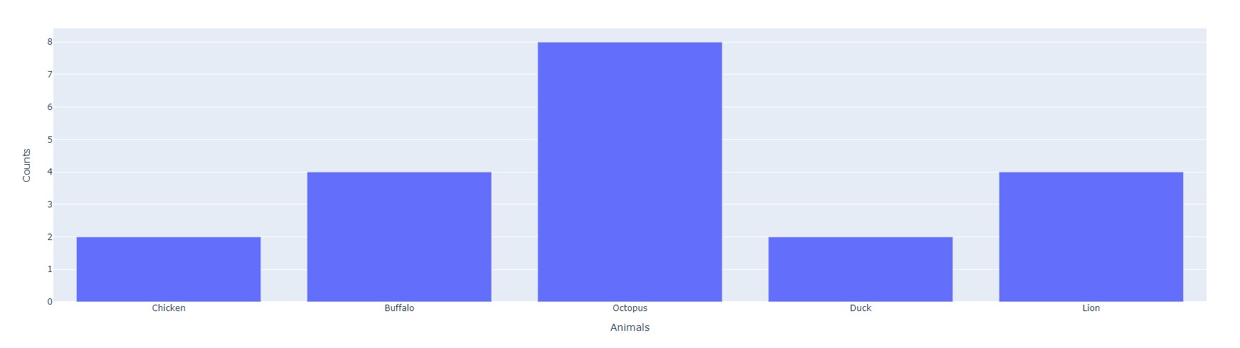
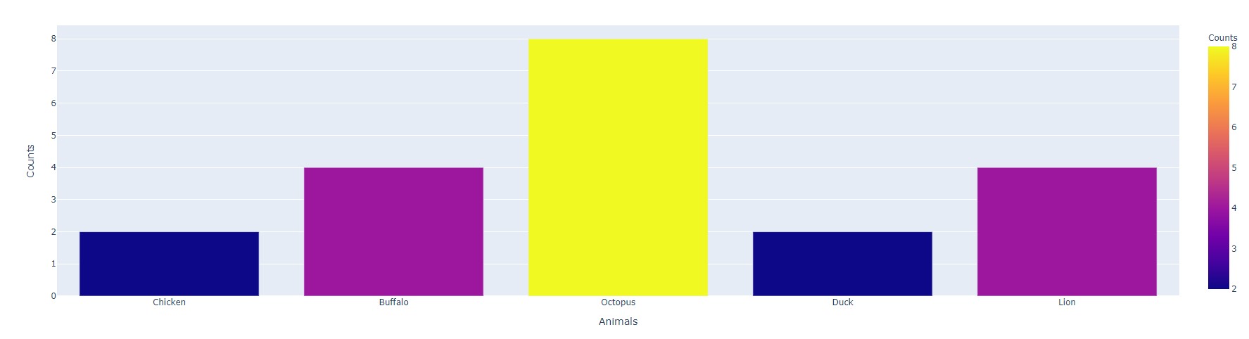
When creating a bar chart, we can use a Pandas Dataframe:
raw_data = {
    'Animals' : ['Chicken', 'Buffalo', 'Octopus', 'Duck', 'Lion'],
    'Counts'  : [2, 4, 8, 4, 2]
}
df = pd.DataFrame.from_dict(raw_data)

bar = px.bar(raw_data, x='Animals', y='Counts')
bar.show()
As seen, we pass in the dataframe and specify the x and y column titles.
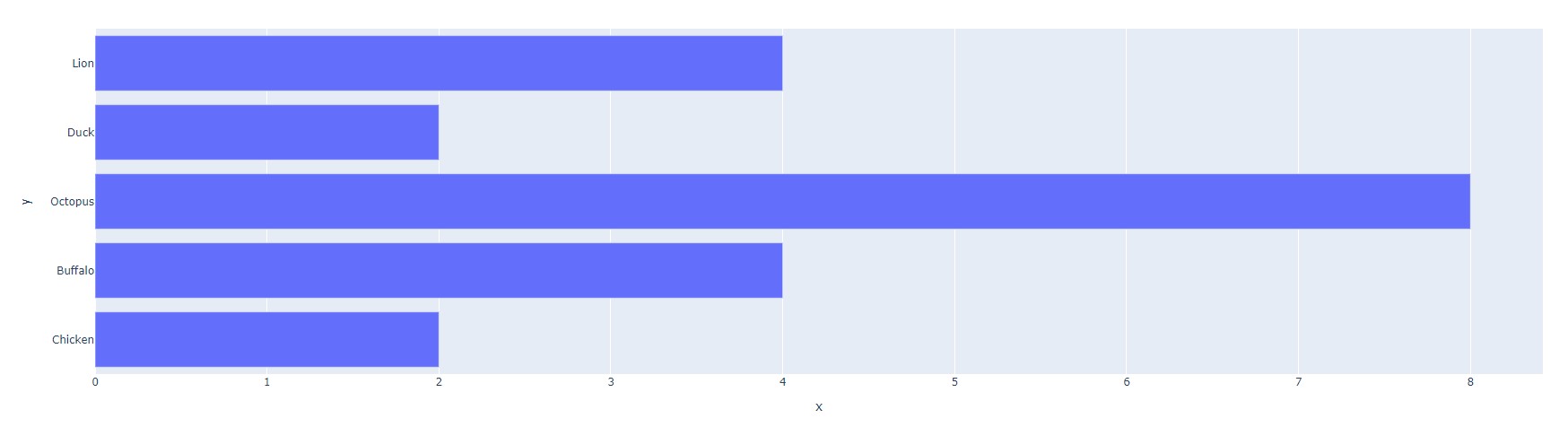
Without DataFrame
Here, we can simply pass in two arrays, one for each of x and y.
animals = ['Chicken', 'Buffalo', 'Octopus', 'Duck', 'Lion']
counts =  [2, 4, 8, 4, 2]

bar = px.bar(x=animals, y=counts)
bar.show()
Even if we don't create a dataframe, Plotly will perform this action under-the-hood when generating the bar chart.
In both cases, we get the same result. And voila, here are our two bar charts!
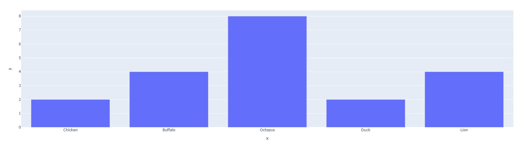
Ahh, you may have noticed a small difference: the axis labels!
When we passed in two arrays, we never specified what the axes were to be titled. How do we fix this and further style our charts? To that, we turn to Plotly's myriad ways of customizing charts.
Styling Figure
There are many ways to style a bar chart. Here are some of the most important ones!
Adding a Title, Axis Labels
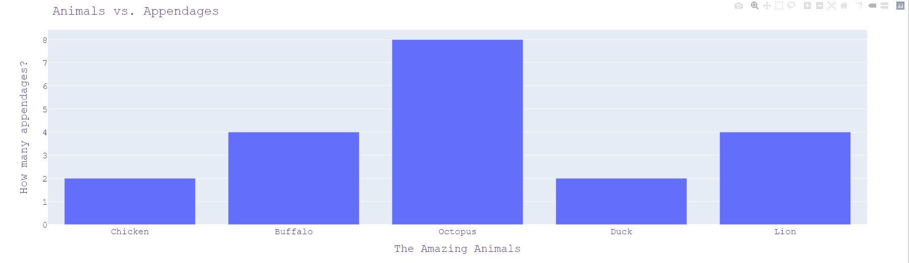
We can add a title with the following function, bar.update_layout():
animals = ['Chicken', 'Buffalo', 'Octopus', 'Duck', 'Lion']
counts =  [2, 4, 8, 2, 4]

bar = px.bar(x=animals, y=counts)

bar.update_layout(
    title="Animals vs. Appendages", # Adding a title
    xaxis_title="The Amazing Animals", # Changing x-axis label
    yaxis_title="How many appendages?", # Changing y-axis label
    font=dict(
        family="Courier New, monospace", # The font style
        color="RebeccaPurple", # The font color
        size=18 # The font size
    )
)

bar.show()
Adding Color
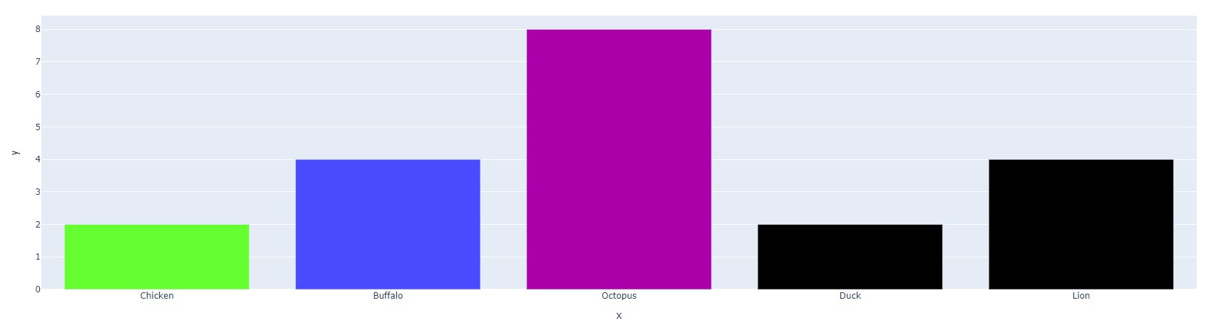
In order to individually select colors for our bar chart, we can use the following:
animals = ['Chicken', 'Buffalo', 'Octopus', 'Duck', 'Lion']
counts =  [2, 4, 8, 2, 4]

# As seen, each bar segment that hasn't had a discrete color entered will be shown in black
bar = px.bar(x=animals, y=counts, color_discrete_sequence=[['#65ff31', '#4a4aff', '#aa00aa']])

bar.show()
We can also use the following argument to make each column visually represent its value.
raw_data = {
    'Animals' : ['Chicken', 'Buffalo', 'Octopus', 'Duck', 'Lion'],
    'Counts'  : [2, 4, 8, 2, 4]
}
df = pd.DataFrame.from_dict(raw_data)

# Creates a side color chart --> each color represents count
bar = px.bar(df, x='Animals', y='Counts', color='Counts')
bar.show()
As seen, it's just a matter of adding the "color" argument!
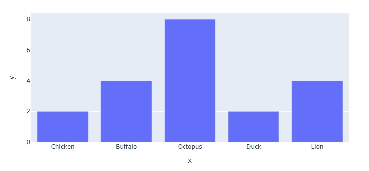
Changing Orientation
In order to make the bar chart horizontal, we can simply add the orientation='h' argument.
animals = ['Chicken', 'Buffalo', 'Octopus', 'Duck', 'Lion']
counts =  [2, 4, 8, 2, 4]

# Notice that we've had to switch the axes!
bar = px.bar(x=counts, y=animals, orientation='h')

bar.show()
NOTE: As mentioned in the above comments, we've had to switch the axes in this horizontal layout!
Width and Height
These can be easily changed via the width and height keywords.
animals = ['Chicken', 'Buffalo', 'Octopus', 'Duck', 'Lion']
counts =  [2, 4, 8, 2, 4]

bar = px.bar(x=animals, y=counts, width=800, height=400)

bar.show()
All Put Together
Using these elements, we can create the following bar chart:
raw_data = {
'Animals' : ['Chicken', 'Buffalo', 'Octopus', 'Duck', 'Lion'],
'Counts' : [2, 4, 8, 2, 4]
}
df = pd.DataFrame.from_dict(raw_data)
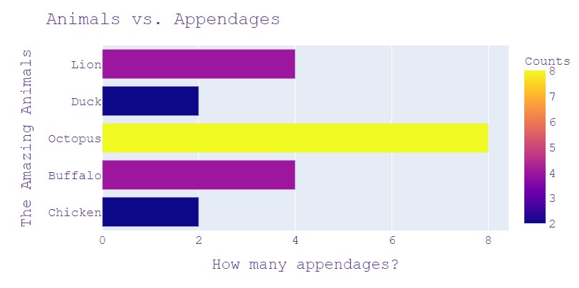
bar = px.bar(df, x='Counts', y='Animals', orientation='h', color='Counts', width=800, height=400)
bar.update_layout(
title="Animals vs. Appendages", # Adding a title
yaxis_title="The Amazing Animals", # Changing x-axis label
xaxis_title="How many appendages?", # Changing y-axis label
font=dict(
family="Courier New, monospace", # The font style
color="RebeccaPurple", # The font color
size=18 # The font size
)
)
bar.show()
NOTE: For more information, make sure to check out the following: Plotly Bar Charts, px.Bar()
The shopowner exclaims, "There's your intro to bar charts! Next, I'd recommend checking out Lenny's Line Charts. He's a cousin of mine and our work is quite similar... "
Walking over, we pull out our laptop and continue our notes...
Plotly Pointers 03
Line Charts
There are a few options to create a line chart!
Loading Data
Once again, we can either use a Pandas Dataframe or just proceed with arrays!
With DataFrame
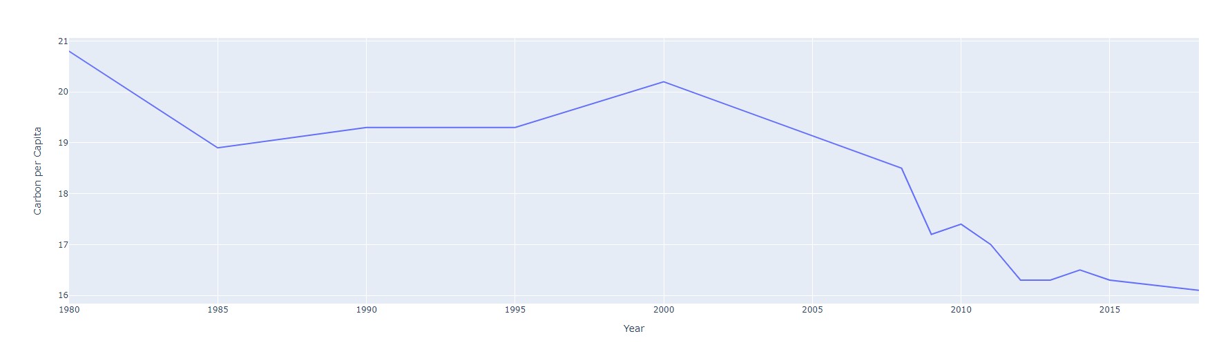
raw_data = {
    'Year' : [1980, 1985, 1990, 1995, 2000, 2008, 2009, 2010, 2011, 2012, 2013, 2014, 2015, 2018],
    'Carbon per Capita' : [20.8,    18.9,   19.3,   19.3,   20.2,   18.5,   17.2,   17.4,   17.0,   16.3,   16.3,   16.5,   16.3,   16.1]
}

df = pd.DataFrame.from_dict(raw_data)

line = px.line(df, x='Year', y='Carbon per Capita')
line.show()
As seen, we pass in the dataframe and specify the x and y column titles.
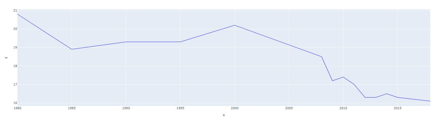
Without DataFrame
Here, we can simply pass in two arrays, one for each of x and y.
year =  [1980, 1985, 1990, 1995, 2000, 2008, 2009, 2010, 2011, 2012, 2013, 2014, 2015, 2018]
carbon = [20.8, 18.9,   19.3,   19.3,   20.2,   18.5,   17.2,   17.4,   17.0,   16.3,   16.3,   16.5,   16.3,   16.1]

line = px.line(x=year, y=carbon)
line.show()
Even if we don't create a dataframe, Plotly will perform this action under-the-hood when generating the line chart.
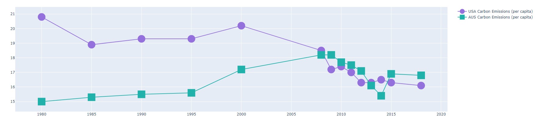
In both cases, we get the same result. And voila, here are our two line charts!
Styling Figure
The methods to style a line chart are very similar to styling a bar chart! However, one neat feature we haven't covered yet is traces. These are quite effective at visualizing multiple sets of data on the same set of axes.
Let's take a closer look!
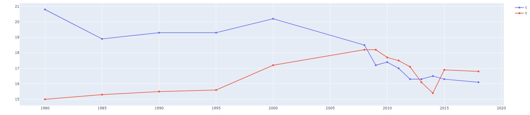
Multiple Traces
In order to add multiple traces, we turn to the Plotly Graph Objects library.
To import this library, we use the following line:
import plotly.graph_objects as go
Next, we can create our traces with the .add_trace() function.
year =  [1980, 1985, 1990, 1995, 2000, 2008, 2009, 2010, 2011, 2012, 2013, 2014, 2015, 2018]
carbon_USA = [20.8, 18.9,   19.3,   19.3,   20.2,   18.5,   17.2,   17.4,   17.0,   16.3,   16.3,   16.5,   16.3,   16.1]
carbon_AUS = [15.0, 15.3,   15.5,   15.6,   17.2,   18.2,   18.2,   17.7,   17.5,   17.1,   16.1,   15.4,   16.9,   16.8]

line = go.Figure()

line.add_trace(go.Scatter(x=year, y=carbon_USA))
line.add_trace(go.Scatter(x=year, y=carbon_AUS))

line.show()
go.Scatter() is a bit misleading!)
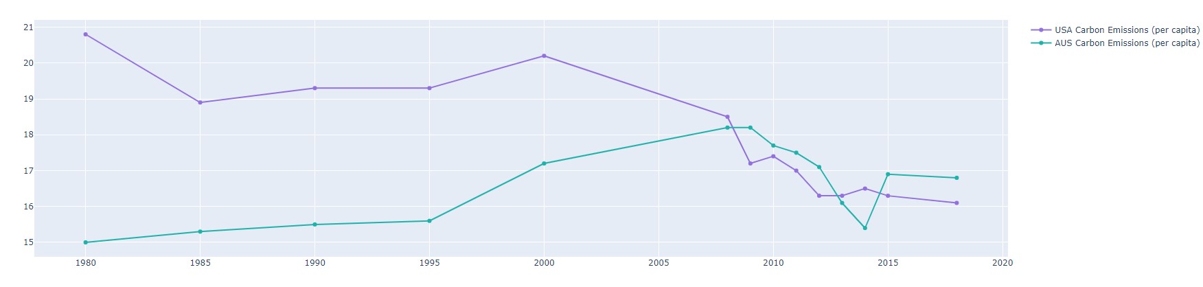
Styling Traces
In order to style these traces and change their legend names from 't', we can add the following:
year =  [1980, 1985, 1990, 1995, 2000, 2008, 2009, 2010, 2011, 2012, 2013, 2014, 2015, 2018]
carbon_USA = [20.8, 18.9,   19.3,   19.3,   20.2,   18.5,   17.2,   17.4,   17.0,   16.3,   16.3,   16.5,   16.3,   16.1]
carbon_AUS = [15.0, 15.3,   15.5,   15.6,   17.2,   18.2,   18.2,   17.7,   17.5,   17.1,   16.1,   15.4,   16.9,   16.8]

line = go.Figure()

line.add_trace(go.Scatter(x=year, y=carbon_USA, marker = dict(color='MediumPurple'), name="USA Carbon Emissions (per capita)"))
line.add_trace(go.Scatter(x=year, y=carbon_AUS, marker = dict(color='LightSeaGreen'), name="AUS Carbon Emissions (per capita)"))

line.show()
Adding the marker=dict(color='MediumPurple') dictionary allows us to change the color of the two traces.
Additionally, the name argument lets us distinguish and label the two traces. Here's the result!
We can further style these traces by exploring the marker dictionary:
year =  [1980, 1985, 1990, 1995, 2000, 2008, 2009, 2010, 2011, 2012, 2013, 2014, 2015, 2018]
carbon_USA = [20.8, 18.9,   19.3,   19.3,   20.2,   18.5,   17.2,   17.4,   17.0,   16.3,   16.3,   16.5,   16.3,   16.1]
carbon_AUS = [15.0, 15.3,   15.5,   15.6,   17.2,   18.2,   18.2,   17.7,   17.5,   17.1,   16.1,   15.4,   16.9,   16.8]

line = go.Figure()

line.add_trace(go.Scatter(x=year, y=carbon_USA,
                          marker = dict(size=25, color='MediumPurple'),
                          name="USA Carbon Emissions (per capita)"))

line.add_trace(go.Scatter(x=year, y=carbon_AUS,
                          marker = dict(size=25, color='LightSeaGreen', symbol='square'),
                          name="AUS Carbon Emissions (per capita)"))

line.show()
As seen below, the size and symbols for each trace can be customized as well!
All Put Together
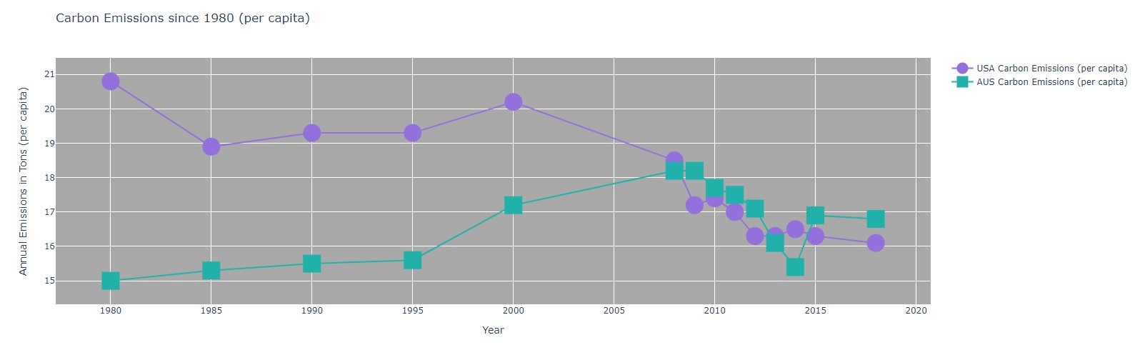
Using these elements and our stylings from the previous section, we can create the following:
year =  [1980, 1985, 1990, 1995, 2000, 2008, 2009, 2010, 2011, 2012, 2013, 2014, 2015, 2018]
carbon_USA = [20.8, 18.9,   19.3,   19.3,   20.2,   18.5,   17.2,   17.4,   17.0,   16.3,   16.3,   16.5,   16.3,   16.1]
carbon_AUS = [15.0, 15.3,   15.5,   15.6,   17.2,   18.2,   18.2,   17.7,   17.5,   17.1,   16.1,   15.4,   16.9,   16.8]

line = go.Figure()

line.add_trace(go.Scatter(x=year, y=carbon_USA,
                          marker = dict(size=25, color='MediumPurple'),
                          name="USA Carbon Emissions (per capita)"))

line.add_trace(go.Scatter(x=year, y=carbon_AUS,
                          marker = dict(size=25, color='LightSeaGreen', symbol='square'),
                          name="AUS Carbon Emissions (per capita)"))

line.update_layout(
    title = "Carbon Emissions since 1980 (per capita)",
    xaxis_title = "Year",
    yaxis_title = "Annual Emissions in Tons (per capita)",
    plot_bgcolor = 'DarkGrey',
    width=1600
)

line.show()
NOTE: For more information, make sure to check out the following: Plotly Line Charts, px.line()
Line charts, check ✅.
A delicious aroma catches our scent, drawing us away from the stall and towards a round-shaped bakery. The shopowner smiles and beckons, "Welcome to Pepé's Pie Charts!"
Laptop opened, we begin to listen...
Plotly Pointers 04
Pie Charts
There are a few options to create a pie chart!
Loading Data
When creating a bar chart, we can use a Pandas Dataframe:
raw_data = {
    'Animals' : ['Chicken', 'Buffalo', 'Octopus', 'Duck', 'Lion', 'Horse', 'Pig'],
    'Counts'  : [9, 3, 1, 5, 4, 8, 8]
}

df = pd.DataFrame.from_dict(raw_data)

pie = px.pie(raw_data, values='Counts', names='Animals')
pie.show()
As seen, we pass in the dataframe and specify the x and y column titles.
Without DataFrame
Here, we can simply pass in two arrays, one for each of x and y.
animals = ['Chicken', 'Buffalo', 'Octopus', 'Duck', 'Lion', 'Horse', 'Pig']
counts =  [9, 3, 1, 5, 4, 8, 8]

pie = px.pie(values=counts, names=animals)
pie.show()
Even if we don't create a dataframe, Plotly will perform this action under-the-hood when generating the pie chart.
In both cases, we get the same result. And voila, here are our two bar charts!
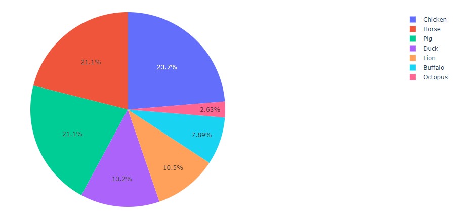
Unlike with bar charts and line charts, there are truly no differences between each!
This is mainly because there are no axes which need labelling 😅.
Styling Figure
There are many ways to style a bar chart. Here are some of the most important ones!
Adding Title, Labels
In order to add a title, we can simply pass in the title argument. To change the
percentages in each slice into labels, we can use the .update_traces() method. The
width of the plot is simply changed via the .update_layouts() method, as done previously.
animals = ['Chicken', 'Buffalo', 'Octopus', 'Duck', 'Lion', 'Horse', 'Pig']
counts =  [9, 3, 1, 5, 4, 8, 8]

pie = px.pie(values=counts,
             names=animals,
             title="The Animals of Old McDonald's Farm",
             )

pie.update_traces(textposition='inside', textinfo='label')
pie.update_layout(width=1000)
pie.show()
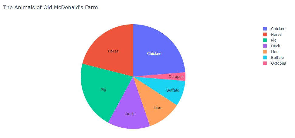
The title can be centered with the title_x argument, which ranges from 0 to 1.
Therefore, setting its value to 0.5 will result in a centered title. Additionally,
the .update_traces() method can be modified to include percentages.
animals = ['Chicken', 'Buffalo', 'Octopus', 'Duck', 'Lion', 'Horse', 'Pig']
counts =  [9, 3, 1, 5, 4, 8, 8]

pie = px.pie(values=counts,
             names=animals,
             title="The Animals of Old McDonald's Farm",
             )

pie.update_traces(textposition='inside', textinfo='label+percent')
pie.update_layout(width=1000)
pie.update_layout(title_x=0.5)
pie.show()
And here's our centered title (relative to the pie chart).
Donuts, Slices
Some neat extensions of pie charts includes donuts and slices!
In order to create a donut chart, we simply need to add the hole=0.2 argument.
animals = ['Chicken', 'Buffalo', 'Octopus', 'Duck', 'Lion', 'Horse', 'Pig']
counts =  [9, 3, 1, 5, 4, 8, 8]

pie = px.pie(values=counts,
             names=animals,
             title="The Animals of Old McDonald's Farm",
             hole=0.2,
             )

pie.update_traces(textposition='inside', textinfo='label+percent')
pie.update_layout(width=1000)
pie.update_layout(title_x=0.5)
pie.show()
In order to highlight specific slices or data values, we can use the pull argument.
Here's an example highlighting the Pig slice!
animals = ['Chicken', 'Buffalo', 'Octopus', 'Duck', 'Lion', 'Horse', 'Pig']
counts =  [9, 3, 1, 5, 4, 8, 8]

pie = px.pie(values=counts,
             names=animals,
             title="The Animals of Old McDonald's Farm",
             hole=0.2,
             )

pie.update_traces(textposition='inside',
                  textinfo='label+percent',
                  pull=[0,0,0,0,0,0,0.1],
                  )
pie.update_layout(width=1000)
pie.update_layout(title_x=0.5)
pie.show()
The length of pull matches the length of animals.
Similarly, each value corresponds to a
specific animal, in matching result. For example, the last element of pull is 0.1, meaning
that the last element of animals, 'Pig', will be pulled out by a factor of 0.1.
Let's try applying this knowledge to pull out 'Chicken' and 'Buffalo' as well!
animals = ['Chicken', 'Buffalo', 'Octopus', 'Duck', 'Lion', 'Horse', 'Pig']
counts =  [9, 3, 1, 5, 4, 8, 8]

pie = px.pie(values=counts,
             names=animals,
             title="The Animals of Old McDonald's Farm",
             hole=0.2,
             )

pie.update_traces(textposition='inside',
                  textinfo='label+percent',
                  opacity=0.9,
                  pull=[0.2,0.3,0,0,0,0,0.1],
                  )
pie.update_layout(width=1000)
pie.update_layout(title_x=0.5)
pie.show()
Neat! And with that, we have a rather fancy pie chart put together in less than a dozen lines of code!
NOTE: For more information, make sure to check out the following: Plotly Pie Charts, px.Pie()
The shopowner looks at our laptop and points at our line charts from before,
"Ahh! I see you've visited Lenny's Lines. Make sure to check out Sylvie's Scatter Plots. It's right next door! That'll come in handy with data points that don't necessarily need to form a line!"
Walking over, we're greeted by a beaming clerk with the initials "S.S.".
"Howdy y'all! I presume you're here to learn about the stunning power of scatter plots..."
Plotly Pointers 05
Scatter Plots
As with most other plots, there are a few options to create a scatter plot!
Loading Data
Here, we'll explore a less-common method with several Star Wars Lego Sets. Each Lego Set is stored as an array of three values: price, piece count, and VIP points. These arrays are added to a list of all eight sets.
Using two iterators, we can create a list of prices and pieces (ordered correctly).
rep_gunship = [349.99, 3292, 2275]; light_cruiser = [159.99, 1336, 1040]
bad_batch_shuttle = [99.99, 969, 650]; meditation_chamber = [69.99, 663, 455]
imperial_maurader = [39.99, 478, 260]; mandalorian_forge = [29.99, 258, 195]
a_wing = [199.99, 1672, 1300]; razor_crest = [129.99, 1023, 845]

sets = [rep_gunship, light_cruiser, bad_batch_shuttle, meditation_chamber, imperial_maurader, mandalorian_forge, a_wing, razor_crest]

price = [sets[i][0] for i in range(len(sets))]
pieces = [sets[i][1] for i in range(len(sets))]

scatter = px.scatter(x=price, y=pieces)
scatter.show()
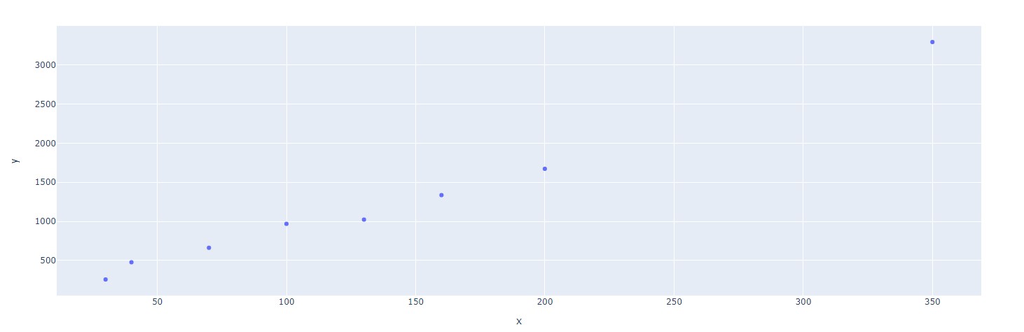
Looking good, but let's add some style!
Styling Figure
Size Attribute
One neat way to flavor our scatter plots is to modify the size attribute. Here,
we can set the size of each datapoint to match a third attribute. In this case, the
third dimension of data will be the number of VIP points earned per set.
# Lego Sets from 2021 (Price, Pieces, VIP Points)

rep_gunship = [349.99, 3292, 2275]; light_cruiser = [159.99, 1336, 1040]
bad_batch_shuttle = [99.99, 969, 650]; meditation_chamber = [69.99, 663, 455]
imperial_maurader = [39.99, 478, 260]; mandalorian_forge = [29.99, 258, 195]
a_wing = [199.99, 1672, 1300]; razor_crest = [129.99, 1023, 845]

sets = [rep_gunship, light_cruiser, bad_batch_shuttle, meditation_chamber, imperial_maurader, mandalorian_forge, a_wing, razor_crest]

price = [sets[i][0] for i in range(len(sets))]
pieces = [sets[i][1] for i in range(len(sets))]
points = [sets[i][2] for i in range(len(sets))]

scatter = px.scatter(x=price, y=pieces, size=points)
scatter.show()
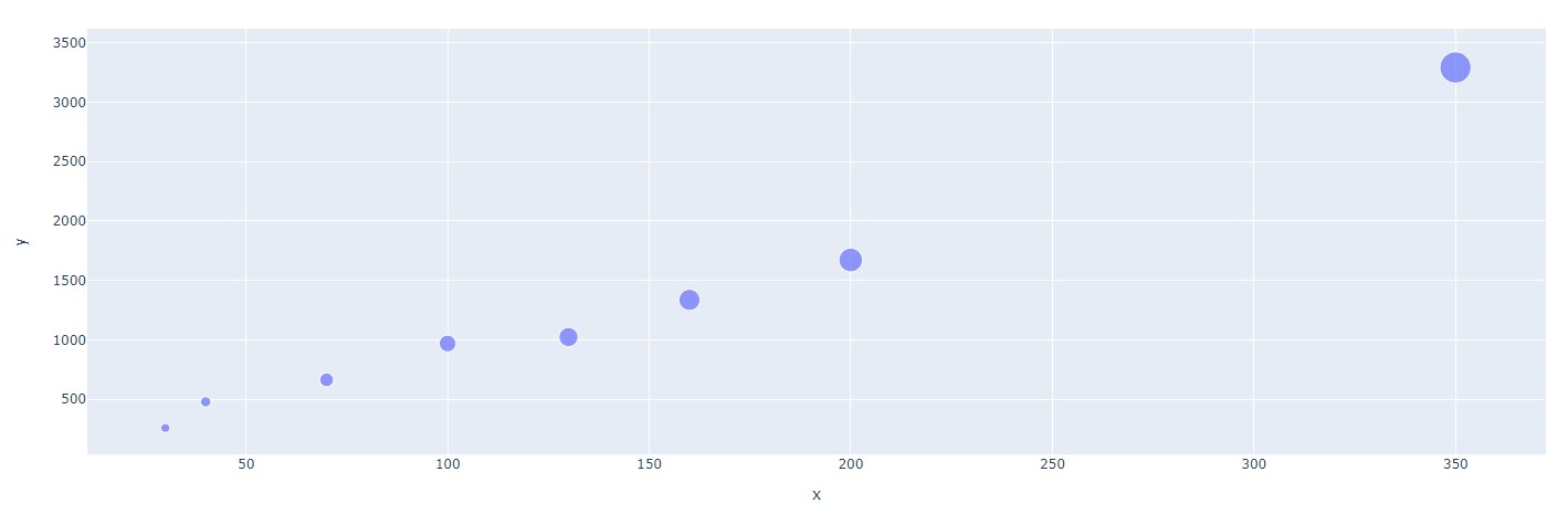
And ta-da, we can easily visualize that larger sets give the most points!
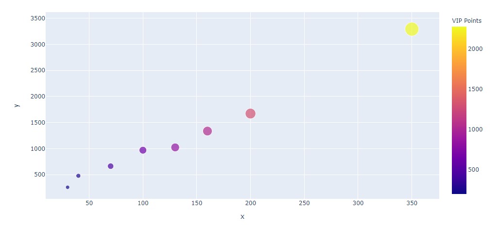
Adding Color
As well as representing VIP points by size, we can also represent this data with color. We simply
need to add the color argument inside of our px.scatter() function.
# Lego Sets from 2021 (Price, Pieces, VIP Points)

rep_gunship = [349.99, 3292, 2275]; light_cruiser = [159.99, 1336, 1040]
bad_batch_shuttle = [99.99, 969, 650]; meditation_chamber = [69.99, 663, 455]
imperial_maurader = [39.99, 478, 260]; mandalorian_forge = [29.99, 258, 195]
a_wing = [199.99, 1672, 1300]; razor_crest = [129.99, 1023, 845]

sets = [rep_gunship, light_cruiser, bad_batch_shuttle, meditation_chamber, imperial_maurader, mandalorian_forge, a_wing, razor_crest]

price = [sets[i][0] for i in range(len(sets))]
pieces = [sets[i][1] for i in range(len(sets))]
points = [sets[i][2] for i in range(len(sets))]

scatter = px.scatter(x=price, y=pieces, size=points, color=points)
scatter.update_coloraxes(colorbar_title="VIP Points")
scatter.update_layout(width=1000) # For better view!
scatter.show()
Adding Trendline
Finally, one useful feature of px.Scatter() is the ability to add trendlines! All it takes
is a simple trendline="ols", where "ols" stands for Ordinary Least Squares regression.
# Lego Sets from 2021 (Price, Pieces, VIP Points)

rep_gunship = [349.99, 3292, 2275]; light_cruiser = [159.99, 1336, 1040]
bad_batch_shuttle = [99.99, 969, 650]; meditation_chamber = [69.99, 663, 455]
imperial_maurader = [39.99, 478, 260]; mandalorian_forge = [29.99, 258, 195]
a_wing = [199.99, 1672, 1300]; razor_crest = [129.99, 1023, 845]

sets = [rep_gunship, light_cruiser, bad_batch_shuttle, meditation_chamber, imperial_maurader, mandalorian_forge, a_wing, razor_crest]

price = [sets[i][0] for i in range(len(sets))]
pieces = [sets[i][1] for i in range(len(sets))]
points = [sets[i][2] for i in range(len(sets))]

scatter = px.scatter(x=price, y=pieces, size=points, color=points, trendline="ols")
scatter.update_coloraxes(colorbar_title="VIP Points")
scatter.update_layout(width=1000) # For better view!
scatter.show()
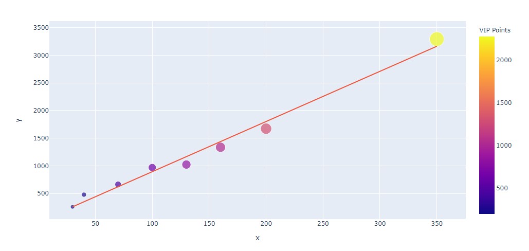
NOTE: Non-linear regression lines can be added as well! For more information, check out: Plotly Trendlines
All Put Together
Using these elements and our stylings from the previous section, we can create the following:
# Lego Sets from 2021 (Price, Pieces, VIP Points)
rep_gunship = [349.99, 3292, 2275]; light_cruiser = [159.99, 1336, 1040]
bad_batch_shuttle = [99.99, 969, 650]; meditation_chamber = [69.99, 663, 455]
imperial_maurader = [39.99, 478, 260]; mandalorian_forge = [29.99, 258, 195]
a_wing = [199.99, 1672, 1300]; razor_crest = [129.99, 1023, 845]
sets = [rep_gunship, light_cruiser, bad_batch_shuttle, meditation_chamber, imperial_maurader, mandalorian_forge, a_wing, razor_crest]
price = [sets[i][0] for i in range(len(sets))]
pieces = [sets[i][1] for i in range(len(sets))]
points = [sets[i][2] for i in range(len(sets))]
scatter = px.scatter(x=price, y=pieces, size=points, color=points, trendline="ols")
scatter.update_coloraxes(colorbar_title="VIP Points")
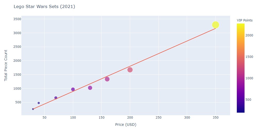
scatter.update_layout(
title = "Lego Star Wars Sets (2021)",
xaxis_title = "Price (USD)",
yaxis_title = "Total Piece Count",
width=1000
)
scatter.show()
NOTE: For more information, make sure to check out the following: Plotly Scatter px.Scatter()
Sylvie turns to us and points at our laptop,
"Y'all have these fancy figures, but they're not part of your dashboard yet! Learning how to add them in is an ancient knowledge you won't be able to find 'round here. Travel past this Port towards Dash's Delta. There, y'all will find the next pieces of your quest."
We smile and wave goodbye, heading out past Port Plotly and down along the coast.
-
All code segments from this chapter can be found in this Colab Notebook. Feel free to follow along! ↩
-
Everything we've installed so far (prerequistes for next section):
↩!pip install -q pyTigerGraph import pyTigerGraph as tg TG_SUBDOMAIN = 'healthcare-dash' TG_HOST = "https://" + TG_SUBDOMAIN + ".i.tgcloud.io" # GraphStudio Link TG_USERNAME = "tigergraph" # This should remain the same... TG_PASSWORD = "tigergraph" # Shh, it's our password! TG_GRAPHNAME = "MyGraph" # The name of the graph conn = tg.TigerGraphConnection(host=TG_HOST, graphname=TG_GRAPHNAME, username=TG_USERNAME, password=TG_PASSWORD, beta=True) conn.apiToken = conn.getToken(conn.createSecret()) !pip install -q jupyter-dash import dash import dash_html_components as html from jupyter_dash import JupyterDash import plotly.express as px import pandas as pd import plotly.graph_objects as go