Dash’s Delta 🌿

As we follow the meandering coastline, we catch sight of the mouth of the rivers heading inland.
A small wooden sign sits next to the wetlands: “Welcome to Dash’s Delta. EST 2013.’
Next to it, several large, strangely-shaped rocks have been arranged in a circular fashion. Taking a closer look, there are several paragraphs etched into each stone. Curious, we begin to read…
Dash's Delta Notes 01
Dash's Libraries
To begin harnessing the power of Dash, we must import the necessary libraries
Dash Core
Dash's core components are a library of higher-level elements such as tables, graphs, dropdowns, inputs, and links. To use these components, we add the following line:
import dash_core_components as dcc
NOTE: For a full list of components, feel free to check out the following: Dash Core Documentation
Bootstrap
Dash allows for the inclusion of native Boostrap components via its Dash Boostrap library. These elements include cards, lists, badges, and more. To use these elements, we install and import the library via the following lines:
!pip install dash-bootstrap-components
import dash_bootstrap_components as dbc
NOTE: For a full list of components, feel free to check out the following: Dash Boostrap Documentation
And voila, we're good to go!
We turn to the next stone and continue to read...
Dash's Delta Notes 02
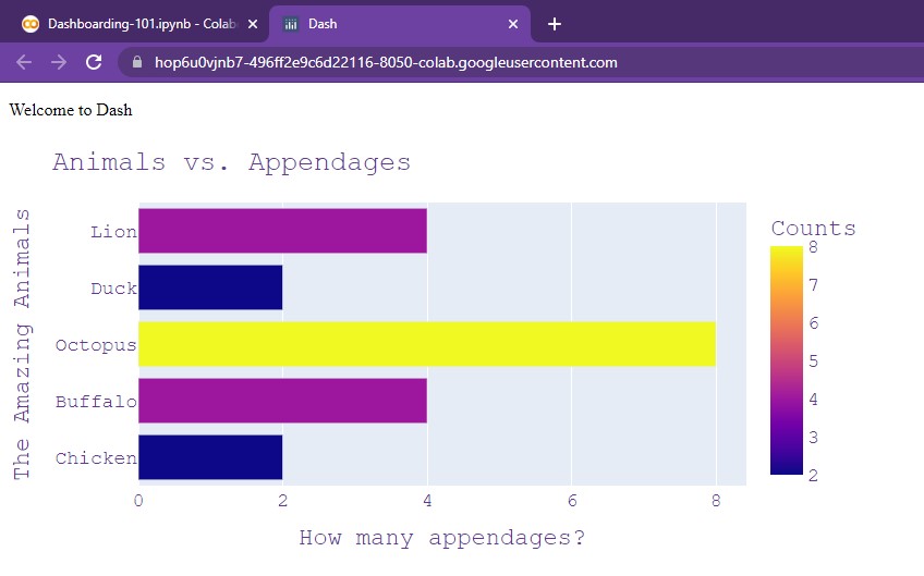
Dash Graph
The figures made from Plotly are dazzling, but still need to be added into the dashboard!
In order to add these charts, we can utilize the dcc.Graph() element. First, we create a function:
def getAnimalChart():
  raw_data = {
  'Animals' : ['Chicken', 'Buffalo', 'Octopus', 'Duck', 'Lion'],
  'Counts'  : [2, 4, 8, 2, 4]
  }

  df = pd.DataFrame.from_dict(raw_data)
  bar = px.bar(df, x='Counts', y='Animals', orientation='h', color='Counts', width=800, height=400)

  bar.update_layout(
      title="Animals vs. Appendages", # Adding a title
      yaxis_title="The Amazing Animals", # Changing x-axis label
      xaxis_title="How many appendages?", # Changing y-axis label
      font=dict(
          family="Courier New, monospace", # The font style
          color="RebeccaPurple", # The font color
          size=18 # The font size
      )
  )
  return bar
This function simply returns our finalized bar chart from the last chapter instead of displaying it.
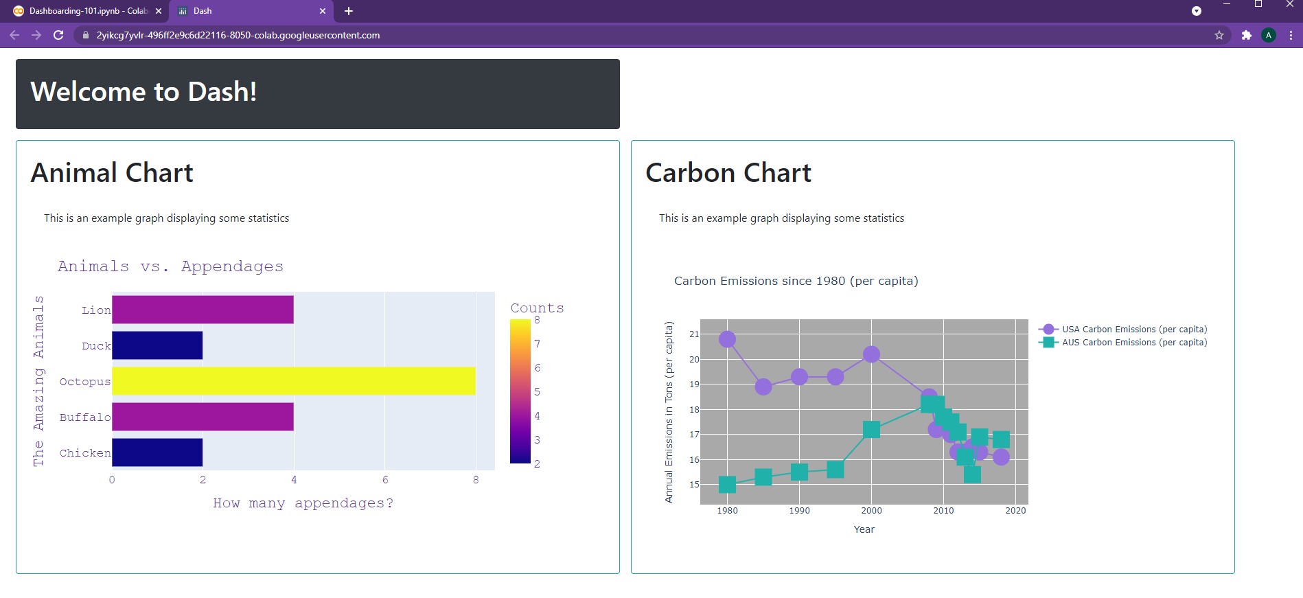
Now, we can add a dcc.Graph() component in our app via the following lines. And here's the result!
app = JupyterDash(__name__)

app.layout = html.Div(children=[
    html.P(children="Welcome to Dash"),
    dcc.Graph(id='Animal Chart', figure=getAnimalChart())
])

app.run_server(mode='external')
NOTE: The
idattribute is optional, but it's a good practice to include a unique ID for each component. This is especially true for updating figures, which will be covered in a later chapter, "Confronted by Callbacks"
Pretty straightforward! Now, we can add our Plotly figures to our dashboard 😄 .
Continuing down the circle, we find the next stone, "Dash Cards"...
Dash's Delta Notes 03
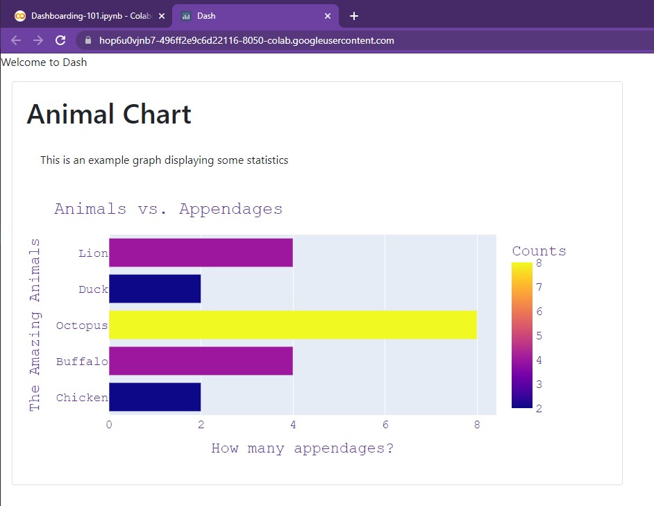
Dash Cards
These graphs we have created are amazing! But not the prettiest...
With cards, any component (especially text, images, and figures) can neatly be displayed within a bounded area. These cards can be customized in terms of style, size, color, outline, and more!
Basic Elements
To get started, we'll create a simple card around our graph from earlier.
app = JupyterDash(__name__, external_stylesheets=[dbc.themes.BOOTSTRAP])

app.layout = html.Div(children=[
    html.P(children="Welcome to Dash"),
    dbc.Card([
        dbc.CardBody([
                      html.H1("Animal Chart", className='card-title'),
                      html.P("This is an example graph displaying some statistics", className='card-body'),
                      dcc.Graph(id='Animal Chart', figure=getAnimalChart())
                    ])
      ],
      style={
          "width":"55rem",
          "margin-left":"1rem"
          }
    )
])

app.run_server(mode='external')
Alright, let's break it down!
At the very top, we must add the Bootstrap external stylesheet in order to utilize the Card component. This
stylesheet comes installed with the library and is accessed with external_stylesheets=[dbc.themes.BOOTSTRAP]
NOTE: We can add our own custom external stylesheets! We'll dive into this in "Sheriff Styles"
With our dbc.Card(), we have a Card Body. this dbc.CardBody() contains a header, paragraph, and our graph.
You may notice the className attribute. This is a custom CSS styling that was imported from the Bootstrap stylesheet.
After this, the dbc.Card() itself contains a style dictionary. In here, we find two attributes:
- Width - this is simply the width of the card.
remis simply the percentage dimension of the screen. As a result,55remmeans that the card will span 55% of the screen's width. - Margin - in particular, the left-most margin has been set to 1% of the screen's width.
margin-bottom,margin-top, andmargin-rightare all valid keywords that can be utilized as well to further adjust our card.
And voila, here's our result:
Let's try changing some of the colors!
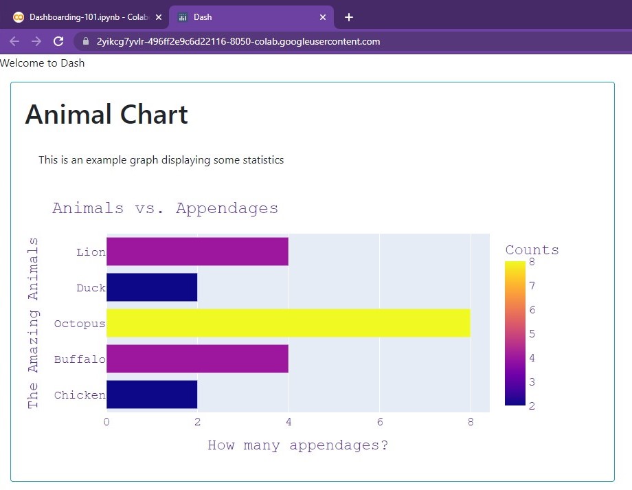
Colors, Outlines
In order to modify the visual appearance of our cards, we can use the color and
outline attributes. color allows for several pre-built options:
primary, secondary, info, success, warning, danger, light, and dark.
For example, here's what info looks like (a light blue):
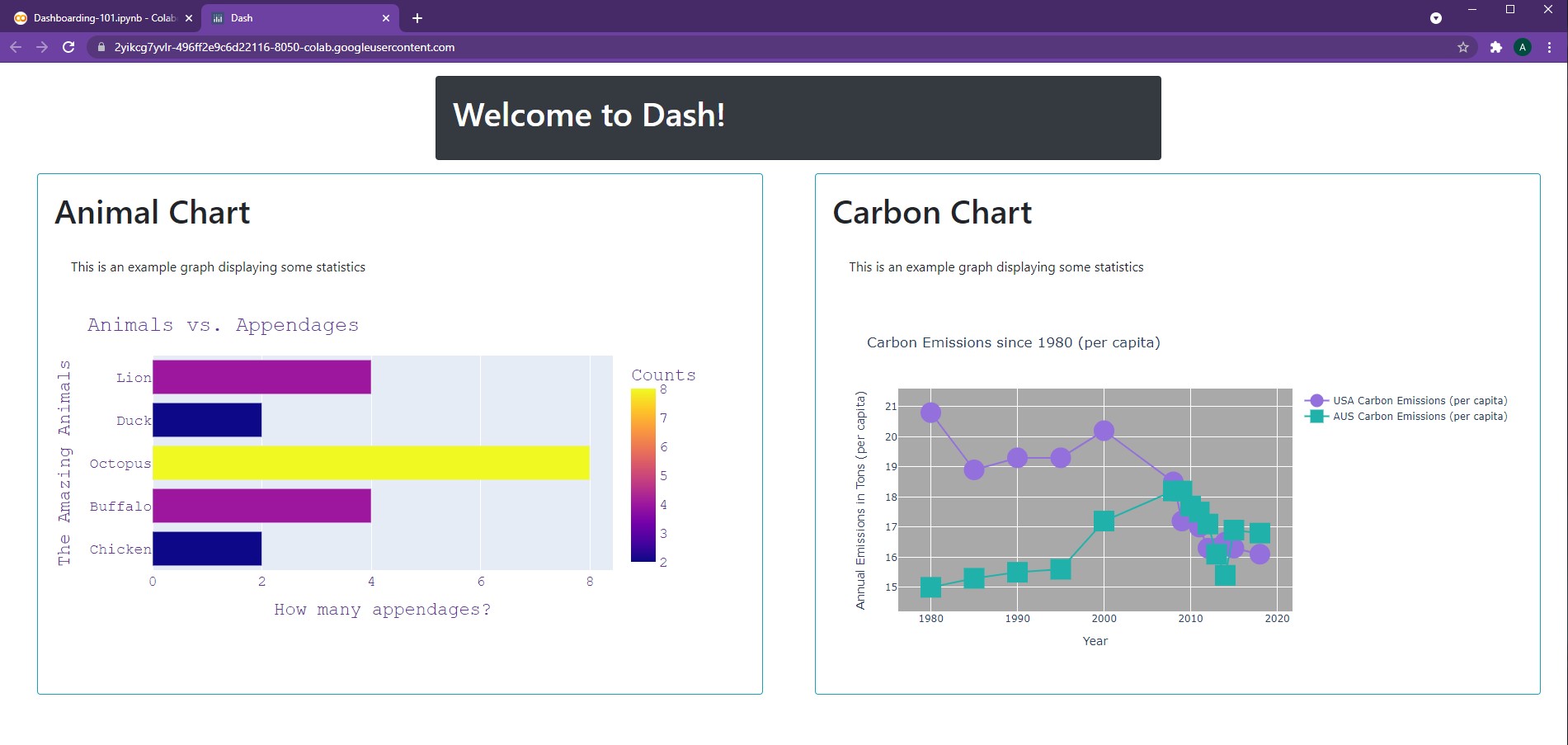
app = JupyterDash(__name__, external_stylesheets=[dbc.themes.BOOTSTRAP])

app.layout = html.Div(children=[
    html.P(children="Welcome to Dash"),
    dbc.Card([
        dbc.CardBody([
                      html.H1("Animal Chart", className='card-title'),
                      html.P("This is an example graph displaying some statistics", className='card-body'),
                      dcc.Graph(id='Animal Chart', figure=getAnimalChart())
                    ])
      ],
      outline=True,
      color='info', # Options include: primary, secondary, info, success, warning, danger, light, dark
      style={
          "width":"55rem",
          "margin-left":"1rem"
          }
    )
])

app.run_server(mode='external')
We can also create a card to hold our title (looks kind of strange by itself in the top corner 😅)
app = JupyterDash(__name__, external_stylesheets=[dbc.themes.BOOTSTRAP])

app.layout = html.Div(children=[
    dbc.Card([
        dbc.CardBody([
                      html.H1("Welcome to Dash!", className='card-title'),
                    ])
      ],
      color='dark', # Options include: primary, secondary, info, success, warning, danger, light, dark
      inverse=True,
      style={
          "width":"55rem",
          "margin-left":"1rem",
          "margin-top":"1rem",
          "margin-bottom":"1rem"
          }
    ),

    dbc.Card([
        dbc.CardBody([
                      html.H1("Animal Chart", className='card-title'),
                      html.P("This is an example graph displaying some statistics", className='card-body'),
                      dcc.Graph(id='Animal Chart', figure=getAnimalChart())
                    ])
      ],
      outline=True,
      color='info', # Options include: primary, secondary, info, success, warning, danger, light, dark
      style={
          "width":"55rem",
          "margin-left":"1rem"
          }
    )
])

app.run_server(mode='external')
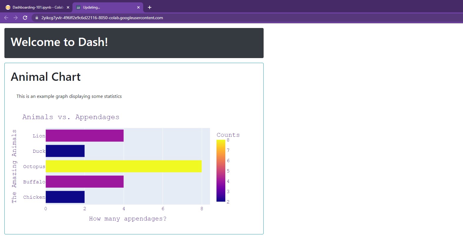
There we go, much better now!
Ahh, you may have noticed the inverse argument! Setting this to True is
helpful when dealing with dark backgrounds as it inverts all text color to white.
As a result, we don't have to manually change the title color.
NOTE: For more information on dbc.Card(), feel free to check out the following: dbc.Card()
Now, what if we want to add multiple cards, but not just continue to vertically stack them?
For that, we must turn to rows and columns!
The stone adjacent to this one is titled "Dash Layout"...
Dash's Delta Notes 04
Dash Layout
The best way to arrange components in our dashboard is via dbc.Row() and dbc.Col().
Let's take a closer look at their power!
Creating Cards
Before beginning, let's create a few cards for better readability:
titleCard =  dbc.Card([
                dbc.CardBody([
                              html.H1("Welcome to Dash!", className='card-title'),
                            ])
              ],
              color='dark', # Options include: primary, secondary, info, success, warning, danger, light, dark
              inverse=True,
              style={
                  "width":"55rem",
                  "margin-left":"1rem",
                  "margin-top":"1rem",
                  "margin-bottom":"1rem"
                  }
            )
def getAnimalBarChart():
    raw_data = {
    'Animals' : ['Chicken', 'Buffalo', 'Octopus', 'Duck', 'Lion'],
    'Counts'  : [2, 4, 8, 2, 4]
    }

    df = pd.DataFrame.from_dict(raw_data)
    bar = px.bar(df, x='Counts', y='Animals', orientation='h', color='Counts', width=800, height=400)

    bar.update_layout(
        title="Animals vs. Appendages", # Adding a title
        yaxis_title="The Amazing Animals", # Changing x-axis label
        xaxis_title="How many appendages?", # Changing y-axis label
        font=dict(
            family="Courier New, monospace", # The font style
            color="RebeccaPurple", # The font color
            size=18 # The font size
        )
    )
    return bar


animalBarCard =  dbc.Card([
                  dbc.CardBody([
                                html.H1("Animal Chart", className='card-title'),
                                html.P("This is an example graph displaying some statistics", className='card-body'),
                                dcc.Graph(id='Animal Chart', figure=getAnimalBarChart())
                              ])
                ],
                outline=True,
                color='info', # Options include: primary, secondary, info, success, warning, danger, light, dark
                style={
                    "width":"55rem",
                    "margin-left":"1rem",
                    "margin-bottom":"1rem"
                    }
              )
def getCarbonLineChart():
    year =  [1980, 1985, 1990, 1995, 2000, 2008, 2009, 2010, 2011, 2012, 2013, 2014, 2015, 2018]
    carbon_USA = [20.8, 18.9,   19.3,   19.3,   20.2,   18.5,   17.2,   17.4,   17.0,   16.3,   16.3,   16.5,   16.3,   16.1]
    carbon_AUS = [15.0, 15.3,   15.5,   15.6,   17.2,   18.2,   18.2,   17.7,   17.5,   17.1,   16.1,   15.4,   16.9,   16.8]

    line = go.Figure()

    line.add_trace(go.Scatter(x=year, y=carbon_USA,
                              marker = dict(size=25, color='MediumPurple'),
                              name="USA Carbon Emissions (per capita)"))

    line.add_trace(go.Scatter(x=year, y=carbon_AUS,
                              marker = dict(size=25, color='LightSeaGreen', symbol='square'),
                              name="AUS Carbon Emissions (per capita)"))

    line.update_layout(
        title = "Carbon Emissions since 1980 (per capita)",
        xaxis_title = "Year",
        yaxis_title = "Annual Emissions in Tons (per capita)",
        plot_bgcolor = 'DarkGrey',
        width=1600
    )

    return line


carbonLineCard =  dbc.Card([
                    dbc.CardBody([
                                  html.H1("Carbon Chart", className='card-title'),
                                  html.P("This is an example graph displaying some statistics", className='card-body'),
                                  dcc.Graph(id='Carbon Chart', figure=getCarbonLineChart())
                                ])
                  ],
                  outline=True,
                  color='info', # Options include: primary, secondary, info, success, warning, danger, light, dark
                  style={
                      "width":"55rem",
                      "margin-left":"1rem",
                      "margin-bottom":"1rem"
                      }
                )
def getAnimalPieChart():
    animals = ['Chicken', 'Buffalo', 'Octopus', 'Duck', 'Lion', 'Horse', 'Pig']
    counts =  [9, 3, 1, 5, 4, 8, 8]

    pie = px.pie(values=counts,
                names=animals,
                title="The Animals of Old McDonald's Farm",
                hole=0.2,
                )

    pie.update_traces(textposition='inside',
                      textinfo='label+percent',
                      opacity=0.9,
                      pull=[0.2,0.3,0,0,0,0,0.1],
                      )
    pie.update_layout(width=1000)
    pie.update_layout(title_x=0.5)

    return pie


animalPieCard =  dbc.Card([
                    dbc.CardBody([
                                  html.H1("Animal Pie Chart", className='card-title'),
                                  html.P("This is an example graph displaying some statistics", className='card-body'),
                                  dcc.Graph(id='Animal Pie Chart', figure=getAnimalPieChart())
                                ])
                  ],
                  outline=True,
                  color='info', # Options include: primary, secondary, info, success, warning, danger, light, dark
                  style={
                      "width":"55rem",
                      "margin-left":"1rem",
                      "margin-bottom":"1rem"
                      }
                )
def getLegoScatterChart():
    rep_gunship = [349.99, 3292, 2275]; light_cruiser = [159.99, 1336, 1040]
    bad_batch_shuttle = [99.99, 969, 650]; meditation_chamber = [69.99, 663, 455]
    imperial_maurader = [39.99, 478, 260]; mandalorian_forge = [29.99, 258, 195]
    a_wing = [199.99, 1672, 1300]; razor_crest = [129.99, 1023, 845]

    sets = [rep_gunship, light_cruiser, bad_batch_shuttle, meditation_chamber, imperial_maurader, mandalorian_forge, a_wing, razor_crest]

    price = [sets[i][0] for i in range(len(sets))]
    pieces = [sets[i][1] for i in range(len(sets))]
    points = [sets[i][2] for i in range(len(sets))]

    scatter = px.scatter(x=price, y=pieces, size=points, color=points, trendline="ols")
    scatter.update_coloraxes(colorbar_title="VIP Points")

    scatter.update_layout(
      title = "Lego Star Wars Sets (2021)",
      xaxis_title = "Price (USD)",
      yaxis_title = "Total Piece Count",
      width=1000
    )

    return scatter


legoScatterCard =  dbc.Card([
                    dbc.CardBody([
                                  html.H1("Lego Scatter Chart", className='card-title'),
                                  html.P("This is an example graph displaying some statistics", className='card-body'),
                                  dcc.Graph(id='Lego Chart', figure=getLegoScatterChart())
                                ])
                  ],
                  outline=True,
                  color='info', # Options include: primary, secondary, info, success, warning, danger, light, dark
                  style={
                      "width":"55rem",
                      "margin-left":"1rem",
                      "margin-bottom":"1rem"
                      }
                )
There we go! Now we have five variables we can use:
titleCard, animalBarCard, carbonLineCard, animalPieCard, legoScatterCard.
Let's see what we can do using them!
dbc.Row()
The function dbc.Row() allows for the creation of rows, enabling horizontal arrangement of elements.
For example, we can create two rows: one to hold our title, another to hold two charts.
app = JupyterDash(__name__, external_stylesheets=[dbc.themes.BOOTSTRAP])

app.layout = html.Div(children=[
   dbc.Row([
            titleCard,
           ],
           style = {
               "margin-left": "0.5rem"
           }
   ),
   dbc.Row([
            animalBarCard,
            carbonLineCard
           ],
           style = {
               "margin-left": "0.5rem"
           }
  )
])

app.run_server(mode='external')
Woah, that looks pretty good!
In order to adjust the elements of rows, we can use the justify argument.
Possible options include: start, center, end, between, and around. For example, here we'll
use center for the title card and around for the body cards.
app = JupyterDash(__name__, external_stylesheets=[dbc.themes.BOOTSTRAP])

app.layout = html.Div(children=[
   dbc.Row([
            titleCard,
           ],
           justify = "center",
           style = {
               "margin-left": "0.5rem"
           }
   ),
   dbc.Row([
            animalBarCard,
            carbonLineCard
           ],
           justify = "around",
           style = {
               "margin-left": "0.5rem",
               "margin-right":"0.5rem"
           }
  )
])

app.run_server(mode='external')
Alright! That looks pretty good so far! Now, let's take a look at adding columns...
dbc.Col()
Let's say we want to add our Pie chart underneath our "Carbon Chart". In order to do this,
we can simply use dbc.Col. To begin, we wrap our "Carbon Chart" in a column and
include our Pie chart as part of that column:
app = JupyterDash(__name__, external_stylesheets=[dbc.themes.BOOTSTRAP])

app.layout = html.Div(children=[
   dbc.Row([
            titleCard,
           ],
           justify = "center",
           style = {
               "margin-left": "0.5rem"
           }
   ),
   dbc.Row([
            animalBarCard,
            dbc.Col([
                     carbonLineCard,
                     animalPieCard
                    ])
           ],
           justify = "around",
           style = {
               "margin-left": "0.5rem",
               "margin-right":"0.5rem"
           }
  )
])

app.run_server(mode='external')
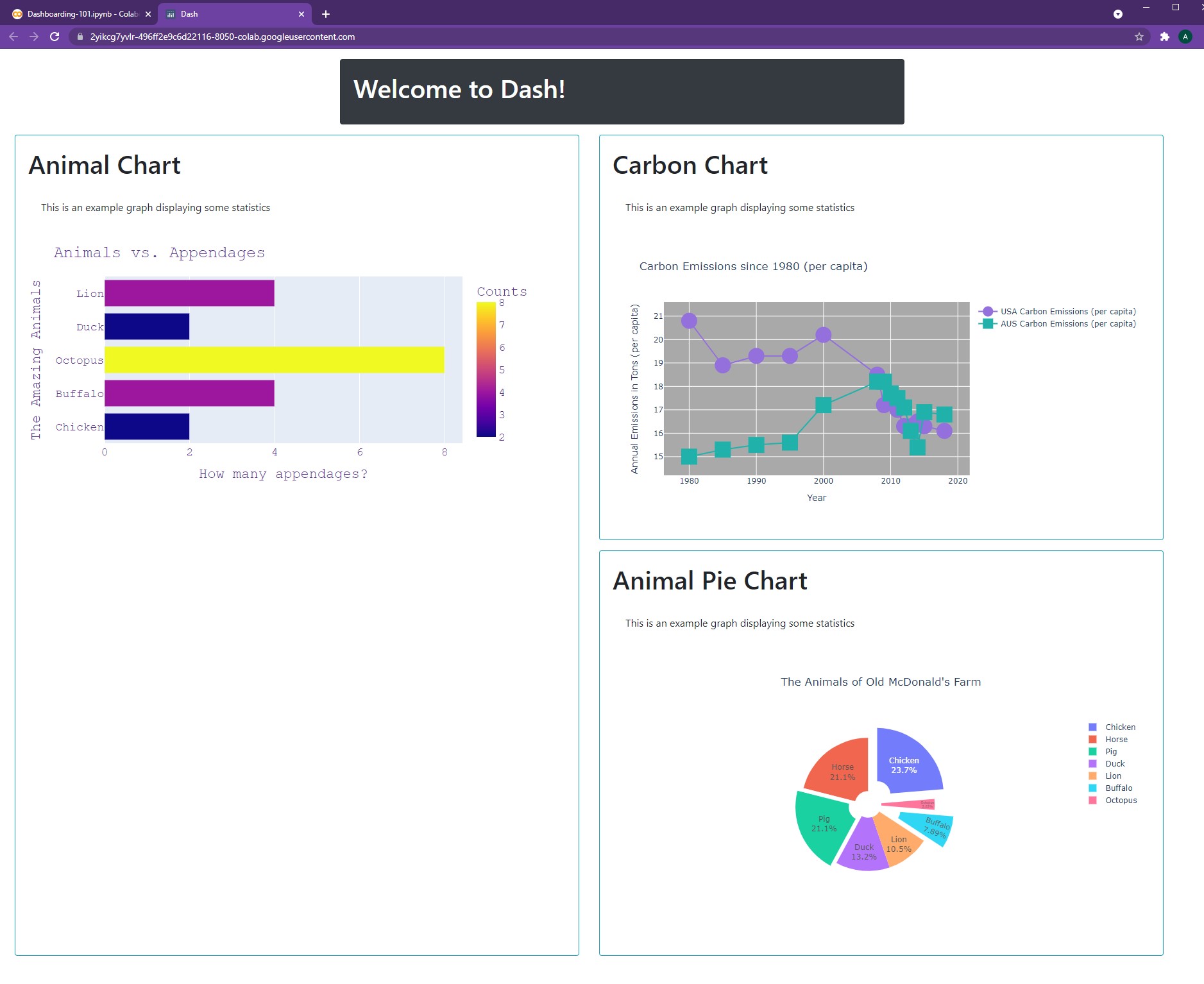
As seen, the row automatically expands in length in order to accommodate for the column's
vertical height. In order to adjust the column's width, we can use the width argument.
This is a value that ranges between 0 and 12.
As a result, width=4 would lead to a column approximately ⅓ of the width of its parent element.
However, we will deal with this keyword and implement it into our dashboard in future chapters!
For now, we can create another column to store our Lego Scatter Plot.
app = JupyterDash(__name__, external_stylesheets=[dbc.themes.BOOTSTRAP])

app.layout = html.Div(children=[
   dbc.Row([
            titleCard,
           ],
           justify = "center",
           style = {
               "margin-left": "0.5rem"
           }
   ),
   dbc.Row([
            dbc.Col([
                     animalBarCard,
                     legoScatterCard,
                    ]),
            dbc.Col([
                     carbonLineCard,
                     animalPieCard
                    ])
           ],
           justify = "around",
           style = {
               "margin-left": "0.5rem",
               "margin-right":"0.5rem"
           }
  )
])

app.run_server(mode='external')
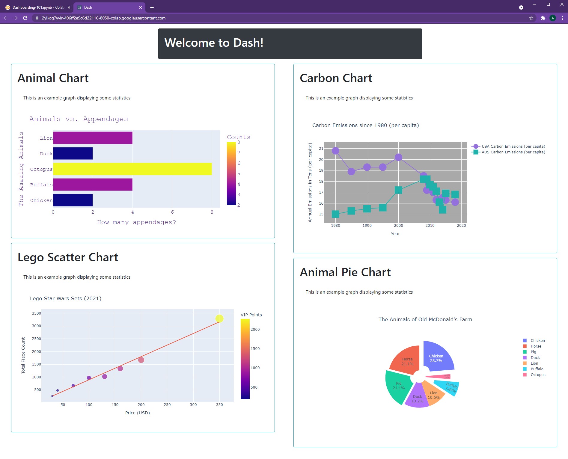
Our dashboard already looks quite stunning. All this, in just four quick chapters 🤩😄.
Next up, a little more tidying...
NOTE: For more information on rows and columns, feel free to check out: dbc.Layout()
As if on cue, we hear a voice, "Howdy' there, you fellas lost?”
Quickly turning around, we see the strangest individual: a horse in a star-studded hat...
-
All code segments from this chapter can be found in this Colab Notebook. Feel free to follow along! ↩
-
Everything we've installed so far (prerequistes for next section):
↩!pip install -q pyTigerGraph import pyTigerGraph as tg TG_SUBDOMAIN = 'healthcare-dash' TG_HOST = "https://" + TG_SUBDOMAIN + ".i.tgcloud.io" # GraphStudio Link TG_USERNAME = "tigergraph" # This should remain the same... TG_PASSWORD = "tigergraph" # Shh, it's our password! TG_GRAPHNAME = "MyGraph" # The name of the graph conn = tg.TigerGraphConnection(host=TG_HOST, graphname=TG_GRAPHNAME, username=TG_USERNAME, password=TG_PASSWORD, beta=True) conn.apiToken = conn.getToken(conn.createSecret()) !pip install -q jupyter-dash import dash import dash_html_components as html from jupyter_dash import JupyterDash import plotly.express as px import pandas as pd import plotly.graph_objects as go import dash_core_components as dcc !pip install dash-bootstrap-components import dash_bootstrap_components as dbc