TigerGraph Tundra 🐯

As we make our way across the delta, the snow-capped mountains begin to encircle us. With each passing minute, the temperature falls while the gusts grow stronger.
Soon, we reach an old wooden sign:
Quite strange indeed. The wind begins to howl and the cold flurries continue to gnaw at our ankles. In the buffeting storm, we hear a voice call out to us.
“Quick, in here!”
An orange outline beckons to us, guiding us towards a rocky cave. Rushing inside, the stranger lights a torch and holds it closer to their face, revealing a… tiger?
“I am the protector of these parts, guide to all those who wish to learn the power of TigerGraph”, the stranger exclaims. “I’ve heard that you are on a quest to create the ultimate dashboard?”
We quietly nod as our savior from the storm turns,
“Come, warm yourselves by the fire. We’ve got a lot to discuss…”
TigerGraph Tutorial 01
Basic pyTigerGraph
In Chapter 01 - Installation Island, we had connected to our Healthcare Starter Kit solution using pyTigerGraph. This connection has several existing functions that we can use to access general information about our graph.
Running Queries
Before beginning, we must execute two queries which will help populate portions of
our Graph. More specifically, running the ex2_main_query followed by the algo_louvain
query creates referral edges used to link prescribers together. These edges are then
used to detect communities of prescribers, which are useful in analyzing the relationships
among healthcare providers, claims, and referrals.
To run these queries, we simply execute the following:
conn.runInstalledQuery("ex2_main_query")
conn.runInstalledQuery("algo_louvain")
And voila, it's as simple as that! Now, we can begin to analyze the vertices and edges of our Graph...
Getting Vertices and Edges
In order to get all vertex types, we run conn.getVertexTypes(). Thes types can then
be iterated through and the number of vertices belonging to each type can be determined
via conn.getVertexCount(). Here's an example!
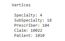
print("Vertices \n")

for vertex in conn.getVertexTypes():
  print(" " + vertex + ": " + repr(conn.getVertexCount(vertex)))
A similar methodology can be used for edges. Simply replace "Vertex" with "Edge",
giving us conn.getEdgeTypes() and conn.getEdgeCount():
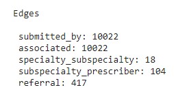
print("Edges \n")

for edge in conn.getEdgeTypes():
  print(" " + edge + ": " + repr(conn.getEdgeCount(edge)))
NOTE: For a comprehensive list, feel free to check out: pyTG functions
"With our general solution statistics ready, we can begin exploring our queries..."
TigerGraph Tutorial 02
Built-in Queries
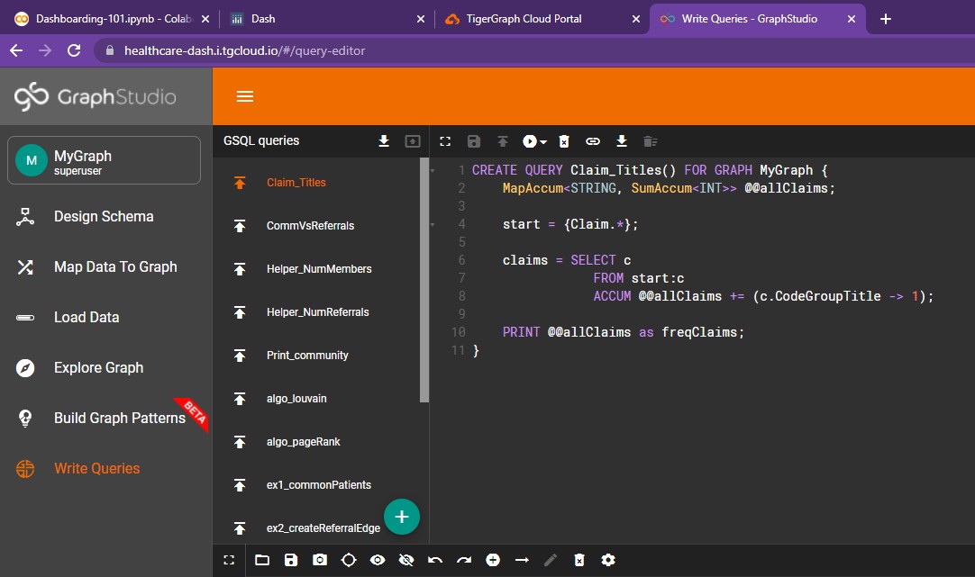
Our Healthcare Starter Kit comes with several pre-built queries. Each of them and their accompanying GSQL can be found in GraphStudio under the "Write Queries" tab. Here's a small snippet of what that page looks like:
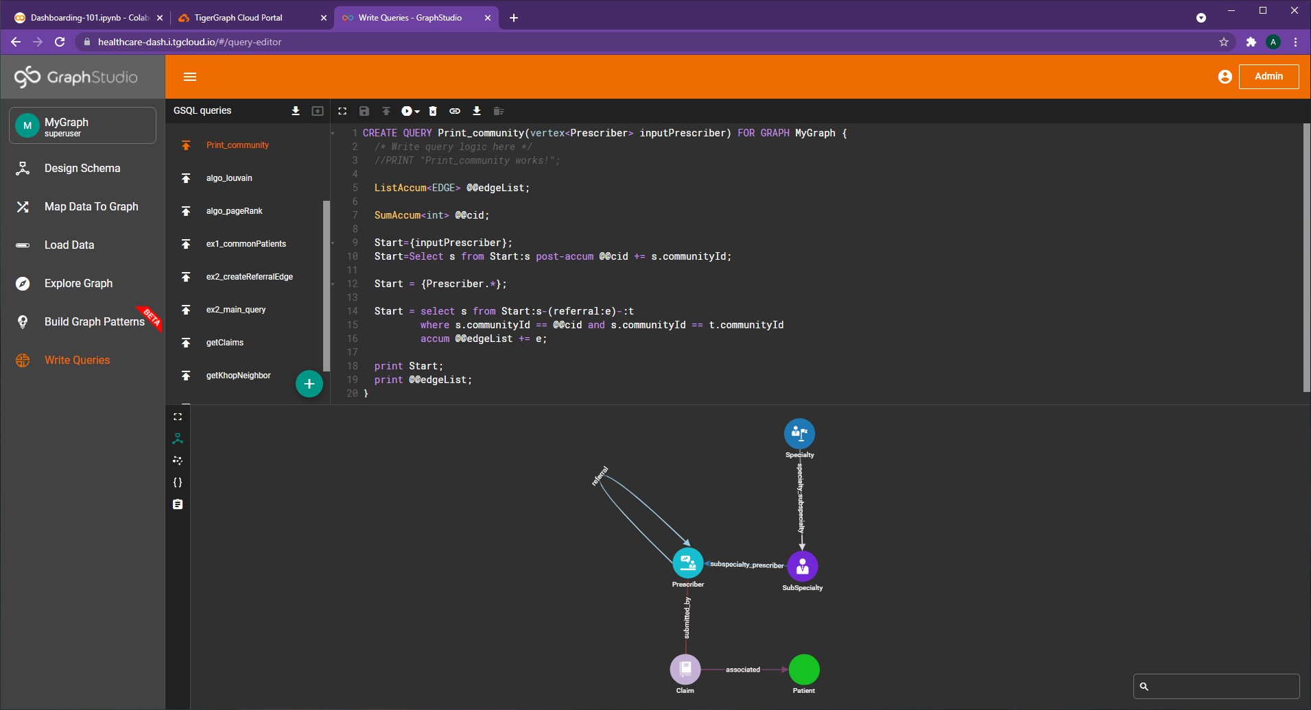
As seen on the left, there are a lot of options to explore!
However, in this section we will dive into getClaims() and Print_community()
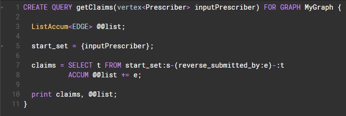
getClaims
The getClaims() query simply returns a list of all claims of a given prescriber.
Here's a screenshot of the GSQL code (via GraphStudio)
In order to access this query from Python, we can use the same conn.runInstalledQuery() as before:
person_num = "pre78"

claims = conn.runInstalledQuery("getClaims", params={"inputPrescriber": person_num})[0]['claims']
print(claims)

As seen, the result is a list of claim vertices (established by 'v_type':'Claim'). Using
each claim's attributes dictionary, we can create a few neat visualizations. First, let's process this data...
claims = conn.runInstalledQuery("getClaims", params={"inputPrescriber": person_num})[0]['claims']
title_map = {}; count_list = []; description_list = []

for number, claim in enumerate(claims):

  title = claim['attributes']['CodeGroupTitle']
  desc = claim['attributes']['ICD10CodeDescription']

  if desc is "":
    desc = "None provided!"

  if title in title_map:
    title_map[title] = title_map[title] + 1
  else:
    title_map[title] = 1

  count_list.append(number)
  description_list.append(desc)
Here, title_map simply keeps track of the frequency of each category of claim. count_list
is simply a list of all the claim numbers while description_list holds the description of
each claim (ex. "Displaced fracture").
Bar Chart
Using this data, we can create a bar chart:
titleList = []
countList = []

for entry in title_map:
  titleList.append(entry)
  countList.append(title_map[entry])

# Next, we create a bar chart using a DataFrame

countData = pd.DataFrame(data=(zip(titleList, countList)), columns=['Claim Title', 'Count'])
bar = px.bar(countData, x='Claim Title', y='Count', title='', color_discrete_sequence =["#DDEE00"]*len(countData))

bar.update_xaxes(type='category', categoryorder='category ascending')
bar.update_layout(margin=dict(l=1, r=1, t=1, b=1), template='ggplot2', xaxis_title=None)

bar.show()
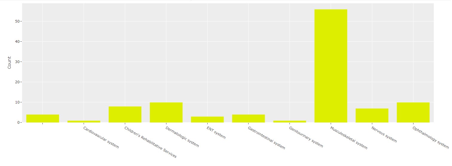
Pretty straightforward now that we've processed our query results!
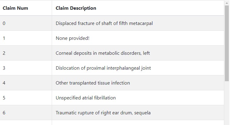
Dash Table
Additionally, we can create a table of each claim. Using Dash Bootstrap Components, this becomes an easy task:
descriptionData = pd.DataFrame(data=(zip(count_list, description_list)), columns=['Claim Num', 'Claim Description'])
header = [html.Thead(html.Tr([html.Th("Claim Number"), html.Th("Claim Description")]))]

table = html.Div(
    dbc.Table.from_dataframe(descriptionData, striped=True, bordered=True),
    style={'overflowY':'scroll', 'height':'450px'}
)
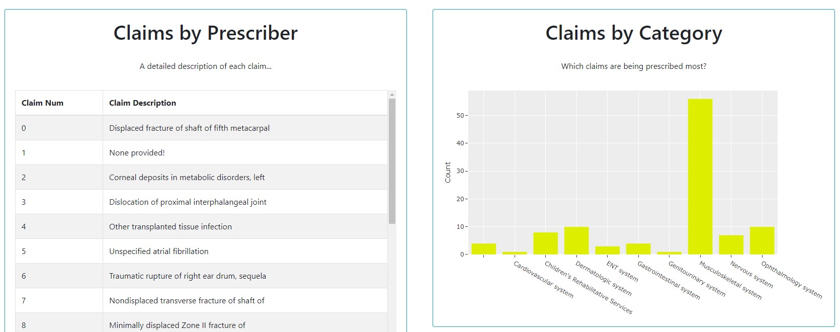
Although this won't show until we add the table element to our dashboard, here's a sneak peek of the result!
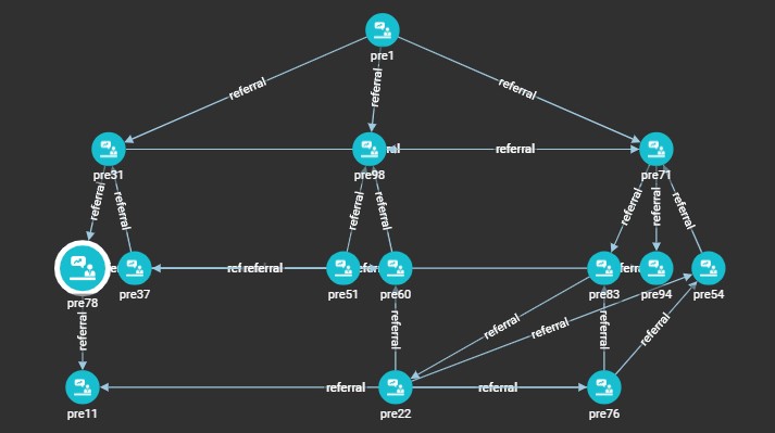
Print_Community
Next up, we have Print_Community, which outputs the prescriber network that the
inputted prescriber belongs to. For example, this is the following result given in
GraphStudio when run with the input of "pre78" (Prescriber 78):
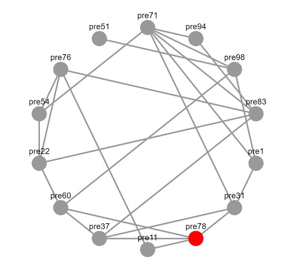
In order to replicate this in Dash, we can utilize dash_cytoscape. This package
allows for the creation of interactive graphs which can be easily modified and
embedded into our dashboard.
!pip install dash-cytoscape
import dash_cytoscape as cyto
Now, we can begin impleninging the network.
def getNetwork(person_num):
  comms = conn.runInstalledQuery("Print_community", params={"inputPrescriber": person_num})[1]['@@edgeList']

  vertices = {}
  els = []

  for entry in comms:
    source = entry['from_id']
    target = entry['to_id']
    if source not in vertices:
      if source == person_num:
        els.append({'data': {'id': source, 'label': source}, 'classes':'red'})
      else:
        els.append({'data': {'id': source, 'label': source}})
    if target not in vertices:
      els.append({'data': {'id': target, 'label': target}})

    els.append({'data': {'source': source, 'target': target}})


  network = cyto.Cytoscape(
                  id='cytoscape',
                  elements=els,
                  layout={'name': 'breadthfirst', 'padding':0, 'x1':-1000},
                  stylesheet= [
                      {
                          'selector': 'node',
                          'style': {
                              'content': 'data(label)'
                          }
                      },
                      {
                          'selector': '.red',
                          'style': {
                              'background-color': 'red',
                            }
                      }
                  ],

                style={'width': '100%', 'height': '500px', 'margin-left':0}
              )

  return network
At the start, we run our query and parse through the results (each vertex/edge)
in the prescriber community to create a list of elements, called els. These
elements are in the appropriate format needed for Cytoscape.
Vertex information is stored as {'data': {'id': source, 'label': source}} while
edge information is stored as {'data': {'id': target, 'label': target}}. In both
cases, source/target are simply vertex IDs.
Although this won't show until we add the network element to our dashboard, here's another sneak peek!
NOTE: For more information, feel free to check out the following resources: Dash Cytoscape
"We can add our own custom queries to our solution as well..."
TigerGraph Tutorial 03
Custom Queries
We can create custom queries in two ways:
- Via GSQL in GraphStudio under the "Write Queries" tab
- In our Python Script via the function
conn.gsql()
Claim_Titles
Let's take a look at a GSQL query that returns a frequency map of all the claims within the Graph.
Claim_Titles = '''USE GRAPH MyGraph
CREATE QUERY Claim_Titles() FOR GRAPH MyGraph {
    MapAccum<STRING, SumAccum<INT>> @@allClaims;

    start = {Claim.*};

    claims = SELECT c
                FROM start:c
                ACCUM @@allClaims += (c.CodeGroupTitle -> 1);

    PRINT @@allClaims as freqClaims;
}
INSTALL QUERY Claim_Titles'''

print(conn.gsql(Claim_Titles, options=[]))
- First, our GSQL is all stored in one variable, a string.
- The first line of our GSQL statement establishes which graph we're using
- The next line is our query header, which establishes the name of the query as well as any parameters or return values. In this case, there are no parameters (indicated by the empty paranthesis after the query name) and we are simply printing the results into a variable rather than returning any values.
Now, we can dive into our query logic.
- With the line
MapAccum<STRING, SumAccum<INT>> @@allClaims;, we create an accumulator that maps strings to a sum accumulator. Each string holds the claim title while the sum accumulator simply counts the number of instances of each claim title - After this, we start with the entire set of vertices of type "Claim".
- Within our
SELECTstatement, we iterate across this entire set of claims and update our accumulator viaACCUM @@allClaims += (c.CodeGroupTitle -> 1); - Finally, we print our map accumulator so that we may access it via Python
- The last line simply installs the query
After writing this query, we run print(conn.gsql(Claim_Titles, options=[]))
in order to install it.
NOTE: If a query is already installed, trying to re-install it will result in an error!
And voila, now we can access this query in GraphStudio as well.
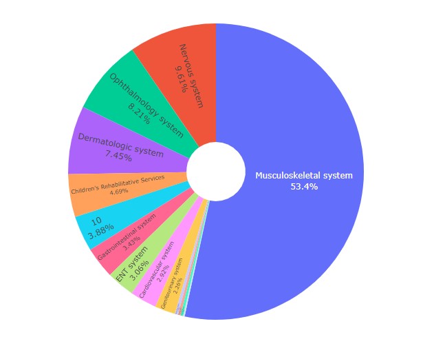
Let's create a Pie Chart using this data!
def getClaimsPieChart():
  res = conn.runInstalledQuery("Claim_Titles")[0]['freqClaims']

  claims = list(res.keys())
  counts = list(res.values())

  pie = px.pie(values=counts,
              names=claims,
              hole=0.2,
              )

  pie.update_layout(width=2000, title_x=0.5, showlegend=False, margin=dict(l=10, r=10, t=10, b=10))
  pie.update_traces(textposition='inside',
                    textinfo='label+percent',
                    )
  return pie
As the outputted result is a map, we can simply use the .keys() and .values() functions
in Python in order to access the results. The rest is standard pie chart creation via Plotly Express.
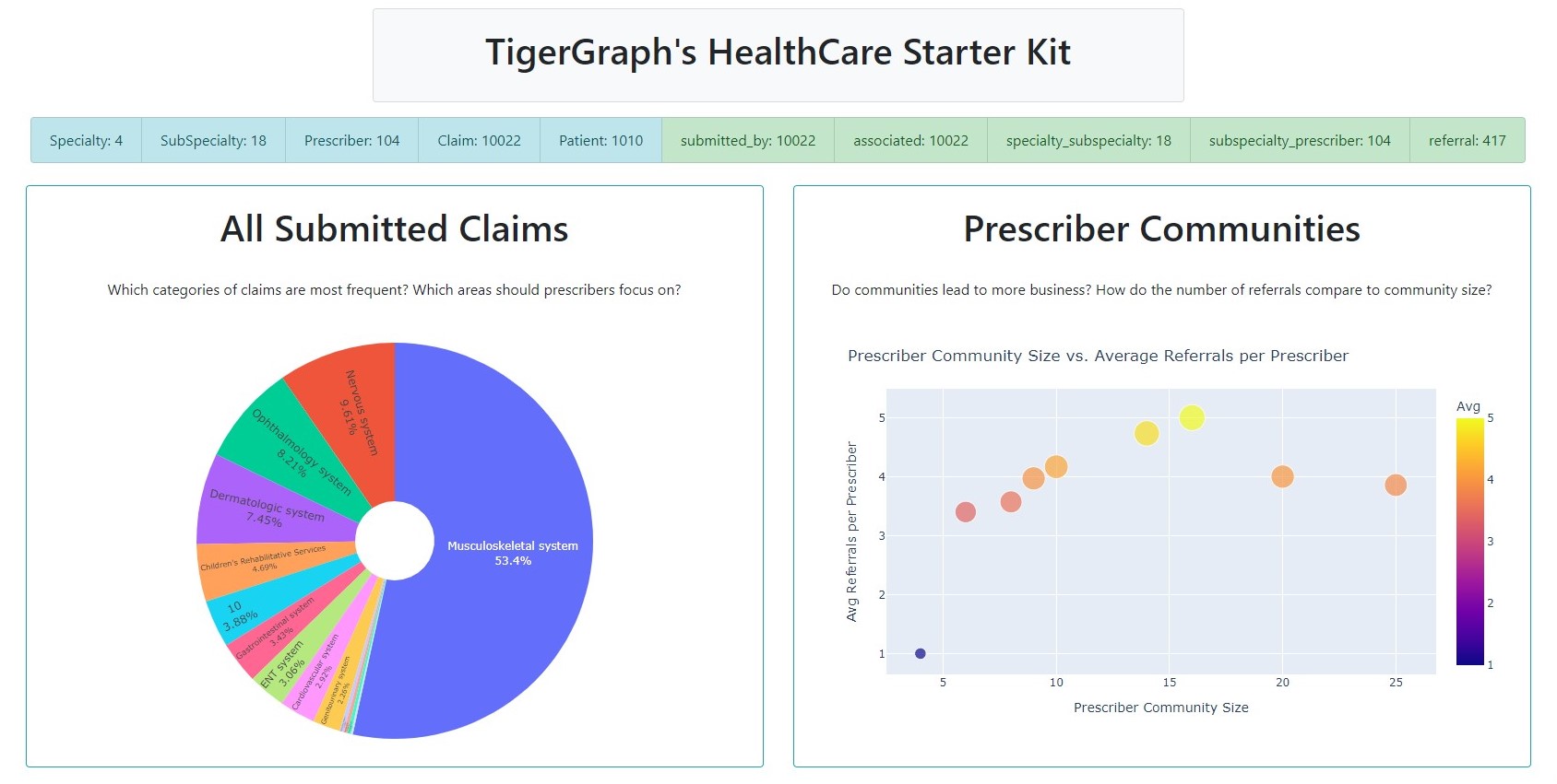
And ta-da, here's our fantastic figure:
CommVsReferrals
Next up, we can create a query to determine if having a larger prescriber network corresponds to an increase in average referrals received. In other words, does being in a prescriber community lead to more business?
Before we can tackle this question, we need to create two helper queries in GSQL...
Helper_NumMembers
First, we need to be able to find the number of community members for a given prescriber.
Helper_NumMembers = '''USE GRAPH MyGraph
CREATE QUERY Helper_NumMembers(vertex<Prescriber> inputPrescriber) FOR GRAPH MyGraph
RETURNS (INT) {
  SumAccum<INT> @@numMembers;
    SumAccum<int> @@cid;

    Start={inputPrescriber};
    Start=Select s from Start:s post-accum @@cid += s.communityId;

    Start = {Prescriber.*};

    Start = select s from Start:s-(referral:e)-:t
            where s.communityId == @@cid and s.communityId == t.communityId
            accum @@numMembers += 1;

  RETURN @@numMembers;
}
INSTALL QUERY Helper_NumMembers'''

print(conn.gsql(Helper_NumMembers, options=[]))
Let's break it down!
- First, this helper query takes a Prescriber vertex as its input. Additionally, it returns
a type
INT, the number of members in the prescriber's community. - We create two accumulators, one to store the number of members in the community, and another to simply store the inputted prescriber's community ID.
- The inputted prescriber's community ID is stored in the first SELECT statement
- In the second SELECT statment, we iterate through every prescriber and increment our counter only if the community IDs of two connected prescribers match.
- This value (the sum accumulator) is returned, not printed!
That wasn't so bad to flesh out! Next up, a similar helper function...
Helper_NumReferrals
Now, we need to be able to find the number of referrals for a given prescriber.
Helper_NumReferrals = '''USE GRAPH MyGraph
CREATE QUERY Helper_NumReferrals(vertex<Prescriber> inputPrescriber) FOR GRAPH MyGraph
RETURNS (INT) {

  SumAccum<INT> @@numReferrals;

    Start={inputPrescriber};

  referrals = SELECT p1
                FROM Start:p1 -(referral:r) -Prescriber:p2
                ACCUM @@numReferrals += 1;

  RETURN @@numReferrals;
}
INSTALL QUERY Helper_NumReferrals'''

print(conn.gsql(Helper_NumReferrals, options=[]))
This is quite similar to our previous helper function:
- In our first and second line, we specify the input parameter and return type respectively
- Next, we create a sum accumulator to store the number of referrals for the inputted prescriber
- In our select statement, we iterate through every referral given and increment the counter by 1.
- The results are returned, not printed!
Using these two helper functions, we can write our main query.
Main Query
In order to write our main query, we can simply reference our two helper functions:
CommVsReferrals = '''USE GRAPH MyGraph
CREATE QUERY CommVsReferrals() FOR GRAPH MyGraph {
  MapAccum<INT, AvgAccum> @@commReferrals;

  start = {Prescriber.*};

  allPres = SELECT p
              FROM start:p
              ACCUM @@commReferrals += (Helper_NumMembers(p) -> Helper_NumReferrals(p));

  PRINT @@commReferrals as commReferrals;
}
INSTALL QUERY CommVsReferrals'''

print(conn.gsql(CommVsReferrals, options=[]))
- First, we create a Map Accumulator for each community size and the average number of referrals that each member in that community received.
- Next, we iterate across all prescribers in our SELECT statement and add the number of members as
well as the number of referrals. Because of our
AvgAccum, we don't have to do any other work!
NOTE: As you may have noticed,
AvgAccumdoes not take a datatype as a parameter!
With this query installed, we can reference and visualize the results.
def getScatterChart():
  referrals = conn.runInstalledQuery("CommVsReferrals")[0]['commReferrals']

  sizes = list(referrals.keys())
  avgs = list(referrals.values())

  scatter = px.scatter(x=sizes, y=avgs, size=avgs, color=avgs)
  scatter.update_coloraxes(colorbar_title="Avg")

  scatter.update_layout(
      title = "Prescriber Community Size vs. Average Referrals per Prescriber",
      xaxis_title = "Prescriber Community Size",
      yaxis_title = "Avg Referrals per Prescriber",
      width=1000
  )
  return scatter
Once again, as the outputted result is a map, we can simply use the .keys()
and .values() functions in Python in order to access the results. And here's
the resulting scatter plot.
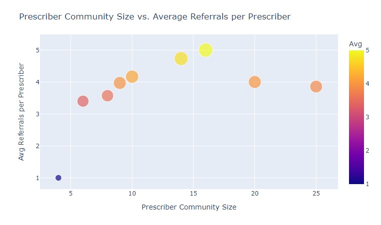
Hmm, a spike around 15 members. A coincidence? Maybe. We'll need more data to find out 😄!
"And finally, we can put together a dashboard using all of what we learned..."
TigerGraph Tutorial 04
Putting it Together
In order to piece everything together, we'll start by storing several components in variables.
Titles and ListGroups
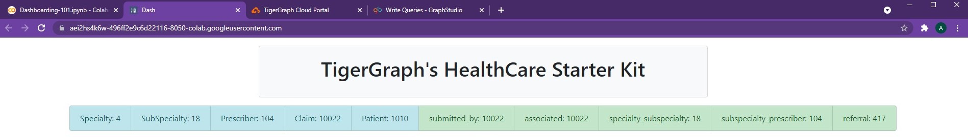
First, we'll create a title card as well as a list group to hold all the vertices and edge counts.
  titleCard =  dbc.Card([
                dbc.CardBody([
                              html.Center(html.H1("TigerGraph's HealthCare Starter Kit", className='card-title')),
                            ])
              ],
              color='light', # Options include: primary, secondary, info, success, warning, danger, light, dark
              style={
                  "width":"55rem",
                  #"margin-left":"1rem",
                  "margin-top":"1rem",
                  "margin-bottom":"1rem"
                  }
            )

vItems = [dbc.ListGroupItem(vertex + ": " + repr(conn.getVertexCount(vertex)), color='info') for vertex in conn.getVertexTypes()]
eItems = [dbc.ListGroupItem(edge + ": " + repr(conn.getEdgeCount(edge)), color='success') for edge in conn.getEdgeTypes()]

listItems = vItems + eItems

statsListGroup = dbc.ListGroup(
                      listItems,
                      horizontal=True
                  )
Pie, Scatter Chart
Next up, we'll use our getClaimsPieChart() and getScatterChart() functions from before
to create two cards.
pieChart = getClaimsPieChart()
scatterChart = getScatterChart()

pieChartCard = dbc.Card([
                  dbc.CardBody([
                                html.H1("All Submitted Claims", className='card-title'),
                                html.P("Which categories of claims are most frequent?\n Which areas should prescribers focus on?", className='card-body'),
                                dcc.Graph(id='Pie Chart', figure=pieChart)
                              ])
                ],
                outline=True,
                color='info', # Options include: primary, secondary, info, success, warning, danger, light, dark
                style={
                    "width":"50rem",
                    "margin-right":"1rem",
                    "margin-bottom":"1rem"
                    }
              )

scatterChartCard = dbc.Card([
                  dbc.CardBody([
                                html.H1("Prescriber Communities", className='card-title'),
                                html.P("Do communities lead to more business? How do the number of referrals compare to community size?", className='card-body'),
                                dcc.Graph(id='Scatter Chart', figure=scatterChart)
                              ])
                ],
                outline=True,
                color='info', # Options include: primary, secondary, info, success, warning, danger, light, dark
                style={
                    "width":"50rem",
                    "margin-left":"1rem",
                    "margin-bottom":"1rem"
                    }
              )
Table, Bar
We can piece together a function getClaims() that generates our table and bar chart.
def getClaims(person_num):

  claims = conn.runInstalledQuery("getClaims", params={"inputPrescriber": person_num})[0]['claims']
  title_map = {}; count_list = []; description_list = []

  for number, claim in enumerate(claims):

    title = claim['attributes']['CodeGroupTitle']
    desc = claim['attributes']['ICD10CodeDescription']

    if desc is "":
      desc = "None provided!"

    if title in title_map:
      title_map[title] = title_map[title] + 1
    else:
      title_map[title] = 1

    count_list.append(number)
    description_list.append(desc)


  # We'll create a table w/ the Descriptions!

  descriptionData = pd.DataFrame(data=(zip(count_list, description_list)), columns=['Claim Num', 'Claim Description'])
  header = [html.Thead(html.Tr([html.Th("Claim Number"), html.Th("Claim Description")]))]

  table = html.Div(
      dbc.Table.from_dataframe(descriptionData, striped=True, bordered=True),
      style={'overflowY':'scroll', 'height':'450px'}
  )

  # We'll create a bar chart w/ the Claim Titles

  titleList = []
  countList = []

  for entry in title_map:
    titleList.append(entry)
    countList.append(title_map[entry])

  countData = pd.DataFrame(data=(zip(titleList, countList)), columns=['Claim Title', 'Count'])
  bar = px.bar(countData, x='Claim Title', y='Count', title='', color_discrete_sequence =["#DDEE00"]*len(countData))

  bar.update_xaxes(type='category', categoryorder='category ascending')
  bar.update_layout(margin=dict(l=1, r=1, t=1, b=1), template='ggplot2', xaxis_title=None)

  max_key = max(title_map, key=title_map. get)

  return len(claims), table, bar, max_key
This function will also return the number of claims as well as the highest claim category (max_key).
Network Graph, Prescriber Info
We can use our getNetwork() function from the "Print_Community" section as well as getClaims()
from above in order to create getPrescriberInfo(). This function will be inputted a prescriber
and return the calculated statistics and figures regarding the prescriber. Although this function
may seem long, most of it is just stylistic cards!
def getPrescriberInfo(person_num):
  network = getNetwork(person_num)
  number, table, bar, max_title = getClaims(person_num)

  prescriberTitleCard = dbc.Card([
          dbc.CardBody([
                        html.Center(dbc.Badge([html.H1("  Prescriber " + person_num + "'s Claims  ", className='card-title')], color="light")),
                        html.Center(html.P("This individual has a total of " + repr(number) + " claims. Their most referred to specialization is: " + max_title, className='card-body')),
                      ])
        ],
        outline=True,
        color='info',
        style={
            "width":"98rem",
            "margin-left":"1rem",
            "margin-bottom":"1rem",
            "margin-top":"1rem"
            }
      )

  tableCard = dbc.Card([
          dbc.CardBody([
                        html.H1("Claims by Prescriber", className='card-title'),
                        html.P("A detailed description of each claim...", className='card-body'),
                        table
                      ])
        ],
        outline=True,
        color='info',
        style={
            "width":"50rem",
            "margin-left":"1rem",
            "margin-bottom":"1rem",
            "margin-top":"1rem"
            }
      )

  barCard = dbc.Card([
          dbc.CardBody([
                        html.H1("Claims by Category", className='card-title'),
                        html.P("Which claims are being prescribed most?", className='card-body'),
                        dcc.Graph(id='Bar Chart', figure=bar)
                      ])
        ],
        outline=True,
        color='info',
        style={
            "width":"50rem",
            "margin-left":"1rem",
            "margin-bottom":"1rem",
            "margin-top":"1rem"
            }
      )

  networkCard = dbc.Card([
          dbc.CardBody([
                        html.H1("Prescriber Network", className='card-title'),
                        html.P("Who's part of this prescriber's community?", className='card-body'),
                        network
                      ])
        ],
        outline=True,
        color='info',
        style={
            "width":"50rem",
            "margin-left":"1rem",
            "margin-bottom":"1rem",
            "margin-top":"1rem"
            }
      )

  return prescriberTitleCard, tableCard, barCard, networkCard, network
As seen, we store all the figures as variables at the top. Next, we create cards for each.
Dashboard Itself
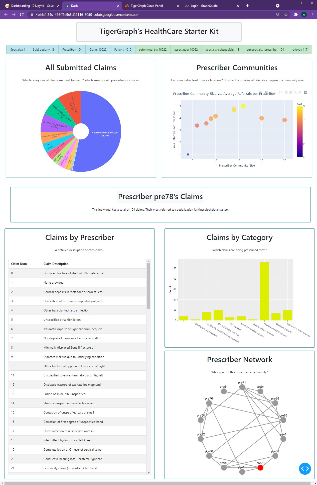
With all of the pieces ready to go, we can finally create our new dashboard.
app = JupyterDash(__name__, external_stylesheets=[dbc.themes.BOOTSTRAP])

person_num = "pre78"
prescriberTitleCard, tableCard, barCard, networkCard, network = getPrescriberInfo(person_num)

app.layout = html.Center(html.Div([

                dbc.Row(titleCard, justify="center"),
                dbc.Row(statsListGroup, justify="center"),
                html.Br(),

                dbc.Row([
                  pieChartCard,
                  scatterChartCard,
                ], justify="center"),

                html.Hr(),

                prescriberTitleCard,
                dbc.Row([
                  dbc.Col([
                      tableCard,
                      network

                  ]),
                  dbc.Col([
                       barCard,
                       networkCard
                  ])
                ], justify="center")

             ]))

app.run_server(mode='external')
Having created all those variables earlier makes the app layout far easier to read and understand.
This is a good practice for creating dashboards, as it allows for easier modification and testing instead of having to scroll through hundreds of lines of card bodies, figures, and more. And now, our hard work pays off:
The TigerGraph protector looks at us and smiles.
"You've come a long way. Yet there's still more to learn in order to complete your quest. Head east, continue past the Tundra, and find the Elysium of Elements. There, you'll truly be able to access everything that you can create using TigerGraph + Plotly..."
-
All code segments from this chapter can be found in this Colab Notebook. Feel free to follow along! ↩
-
Everything we've installed so far (prerequistes for next section):
↩!pip install -q pyTigerGraph import pyTigerGraph as tg TG_SUBDOMAIN = 'healthcare-dash' TG_HOST = "https://" + TG_SUBDOMAIN + ".i.tgcloud.io" # GraphStudio Link TG_USERNAME = "tigergraph" # This should remain the same... TG_PASSWORD = "tigergraph" # Shh, it's our password! TG_GRAPHNAME = "MyGraph" # The name of the graph conn = tg.TigerGraphConnection(host=TG_HOST, graphname=TG_GRAPHNAME, username=TG_USERNAME, password=TG_PASSWORD, beta=True) conn.apiToken = conn.getToken(conn.createSecret()) !pip install -q jupyter-dash import dash import dash_html_components as html from jupyter_dash import JupyterDash import plotly.express as px import pandas as pd import plotly.graph_objects as go import dash_core_components as dcc !pip install dash-bootstrap-components import dash_bootstrap_components as dbc !pip install dash-cytoscape import dash_cytoscape as cyto